Long gone is the idea that all important homepage content must be above the fold, or included in the top 600-800 pixels of a page. Numerous user tests and anecdotal evidence has uncovered that yes, users can and do scroll.
This isn't to say that what's above the fold isn't important - because it is very important. The content included in the above the fold web design is more valuable for attracting and maintaining visitors' attention than the information below the fold.
3 Above The Fold Website Designs To Spark Your Inspiration
Website designers must decide on what content to place above the fold in order to entice users to explore a web page. They must recognize the information required for a visitor at their stage in the customer journey.
Finding a place for the content on the page can be difficult depending on the design of the website. Including a free shipping call-out banner, best sellers slider module and a simple text link for career opportunities is highly encouraged to ensure a positive user experience.
We're sharing these above the fold website designs to help inspire the design of your eCommerce website.
The Full-Width Banner
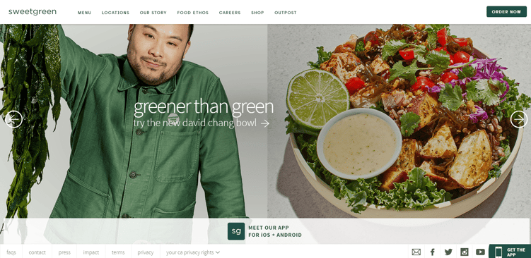
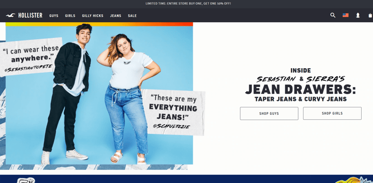
You can see above how both Sweetgreen and Hollister designed their homepages using a full-width banner. Both sites are fairly bare-boned above the fold.
Sweetgreen uses a main image module that allows users to click through various images and discover different items with calls-to-action. In the example above, users are encouraged to "try the new david chang bowl."
Hollister uses a slightly different approach with a single full-width banner image and customer testimonials on the home page. Users are encouraged to shop for jeans with the "shop guys" and "shop girls" CTAs.
Let's take a look at the scroll options for both sites. Sweetgreen has all important information above the fold because there is not an option to scroll. If you scroll down on Hollister's home page, you'll notice that there is content below the fold. However, they've decided their most important information is a single, concise message with compelling visuals and simple CTAs.
The Faux-Width Banner
Sometimes trying to create a full width banner can be difficult if you don't have the right photography. A very wide image (about 960px) that may only be 300-500px tall can lead to some awkward photos if the photo wasn't purposely shot and cropped for the site. As a result, many eCommerce sites have done what we call the faux-width banner.
See below how H&M uses a faux-width banner on its homepage. Although the CTA is not placed above the fold, it's the first thing users' eyes are drawn to as they scroll down the page.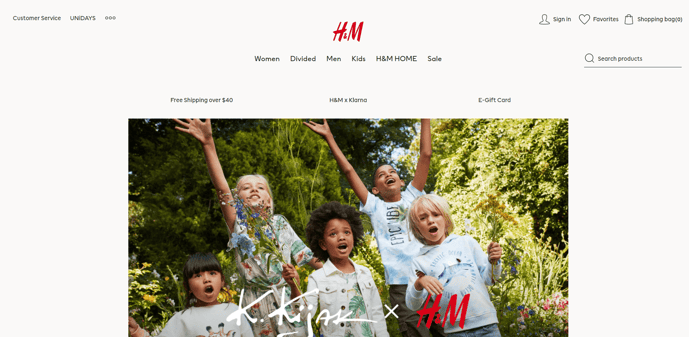
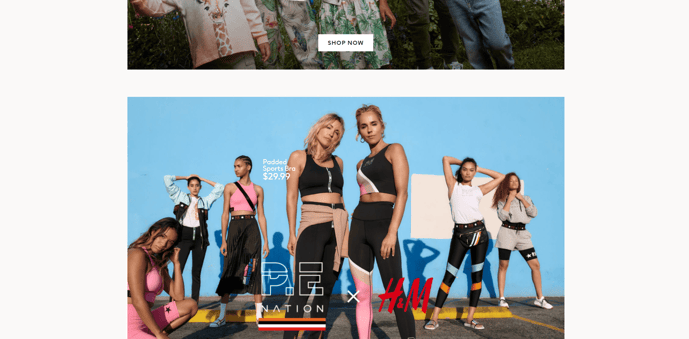
We encourage using a faux-width banner if your image cannot be stretched to fit a width it wasn't necessarily captured for.
The 3:1 or 2:1 Ratio
Similar to the faux-width banner, some sites use an extra column to the right of the main homepage banner to highlight other areas of the site. As you can see in the image below, Search Engine Journal highlights 3 additional areas of its website on the right side of its homepage.
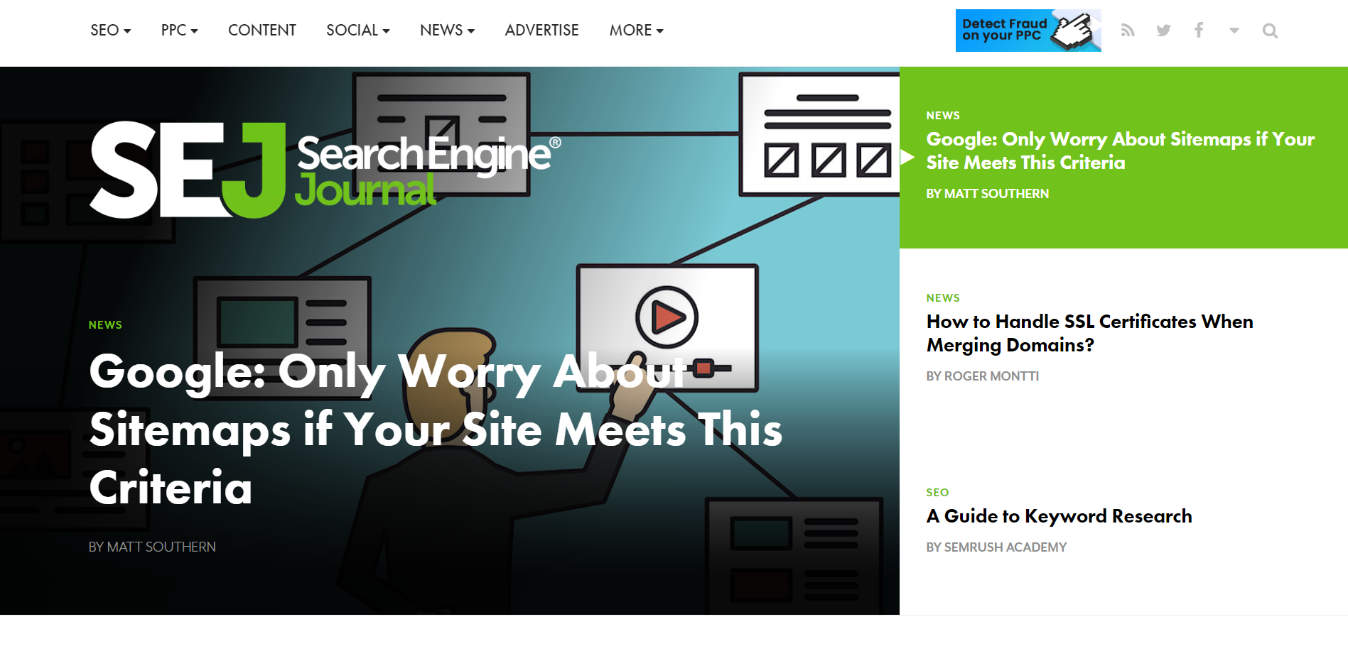
Keep in mind to highlight only the most important information. For example, if your eCommerce brand sells clothing and accessories, be sure to tell website visitors when and if there is a sale and what that sale is.
Anthropologie's home page, pictured below, does a great job of sharing only the most important information with its visitors.
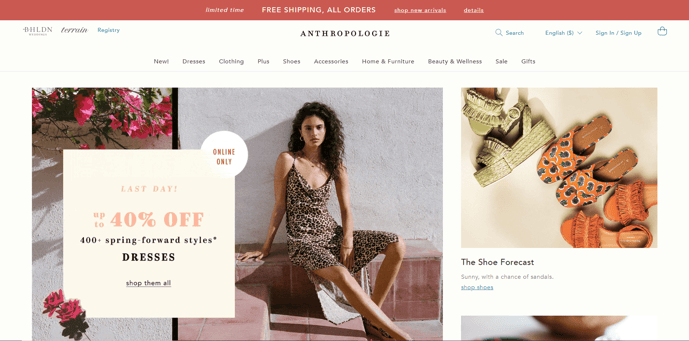
In addition to strategically placing its unique value proposition (free shipping) at the top of its home page, Anthropologie uses 2 direct CTAs. Not only does the home page convey that it's the last day for up to 40% off, but it also provides a sneak peek of the shoes that Anthropologie has to offer.
Although obvious, it's important to note that a great above the fold web design must keep up with the seasons and trends. With Spring quickly approaching, Anthropologie is a step ahead of the competition by already promoting Spring essentials. Keep this in mind not only at the changing of seasons but also for holidays.
So, how do you choose what type of content to use next to your main banner? To avoid guessing, we recommend strategy and testing. For example, if you know that new products sell 50% better in their first 4 weeks, then put those products front and center as soon as you can.
Conclusion
Be sure to have statistics for each item placed above the fold to back up your decisions. There is always room for improvement. If you recognize that a piece of content is not performing as well as another, change your eCommerce strategy to improve your website's performance. Remember to include the most important information above the fold to keep customers intrigued in your brand.
We hope these above the fold design strategies help to inspire the design of your site. If you have any questions or concerns, or would like additional help creating your above the fold web design, contact us through the form below. Our design team will be happy to help!

E-BOOK
20 Best Shopify Apps For Your eCommerce Store
Explore tags:
About the author
Subscribe to the Groove Newsletter
Get the latest updates and insights straight to your inbox


