When it comes to building, redesigning or enhancing a website, designers have many elements and opinions to consider. A website's design lays the foundation for a positive user experience, and a positive user experience increases conversions.
5 eCommerce Design Principles
Implementing web design tips enhances your eCommerce site and ultimately leads to increased conversions. In this blog, we're sharing the following 5 eCommerce design principles to ensure a solid foundation for a conversion-driven website.
- Simple and functional navigation
- Intentional minimal design
- Consider card design
- Clear call-to-action
- Painless checkout process
Simple And Functional Navigation
According to HubSpot, 55% of visitors spend fewer than 15 seconds on your website. Needless to say, users are likely to exit out of your site if they cannot find what they need within a few clicks.
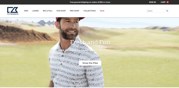
Test your sitemap and menu structure to check for unnecessary pages and actions in the user flow. Try to limit your header to the following elements:
- Your brand's logo
- Between 3-7 main navigation links
- Between 3-5 utility navigation links
- Prominent search bar functionality
With concise navigation options and categorization, users are able to intuitively interact with your site and are driven further down the path to conversion.
See below how Cutter & Buck's website is designed with these elements in mind:
Intentional Minimal Design
Less is more. This popular phrase holds true when it comes to the user experience and user interface of each page of your website. Users will enter your site through a variety of landing pages - not just the homepage.
It's imperative that all elements, modules and content are clearly executed in the design. These necessary components are the key to moving visitors one step closer to conversion.
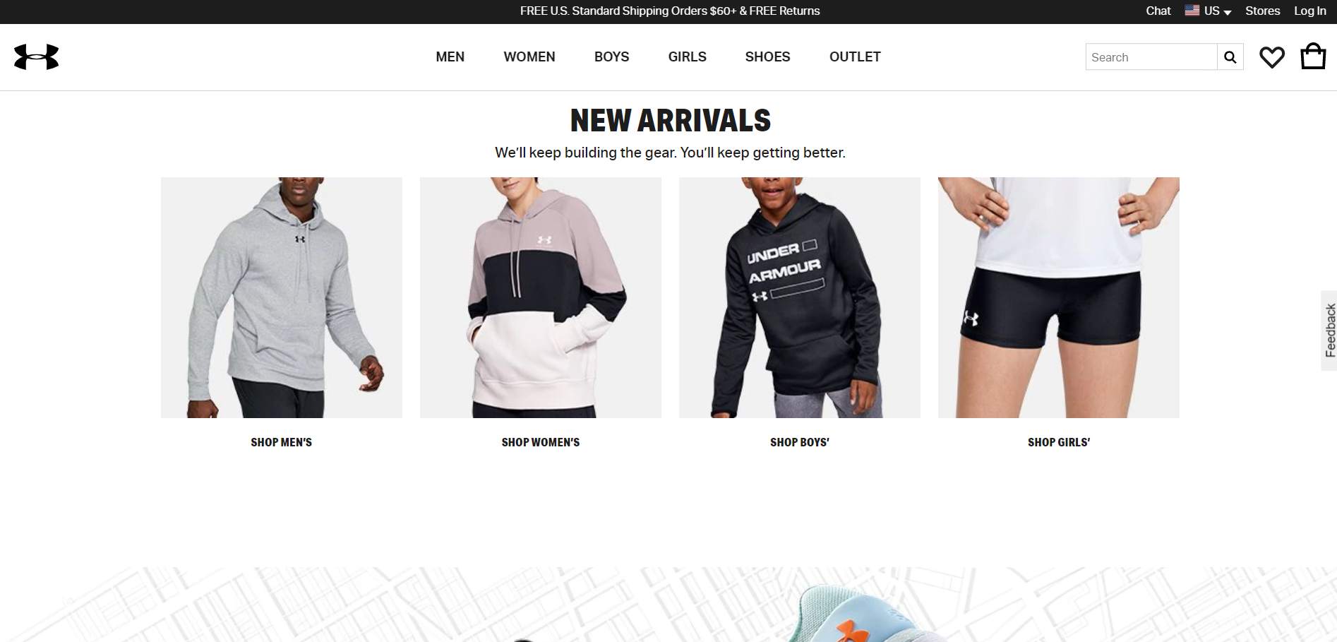
Ensure the success of your design by utilizing white space. Don't clutter the white space with more images or content.
White space is just as valuable as imagery and content. The key is to strike the proper balance that allows users to easily digest a page, get more out of what they see, and drive them down the path to conversion.
See below how Under Armour makes great use of white space on their homepage:
Consider Card Design
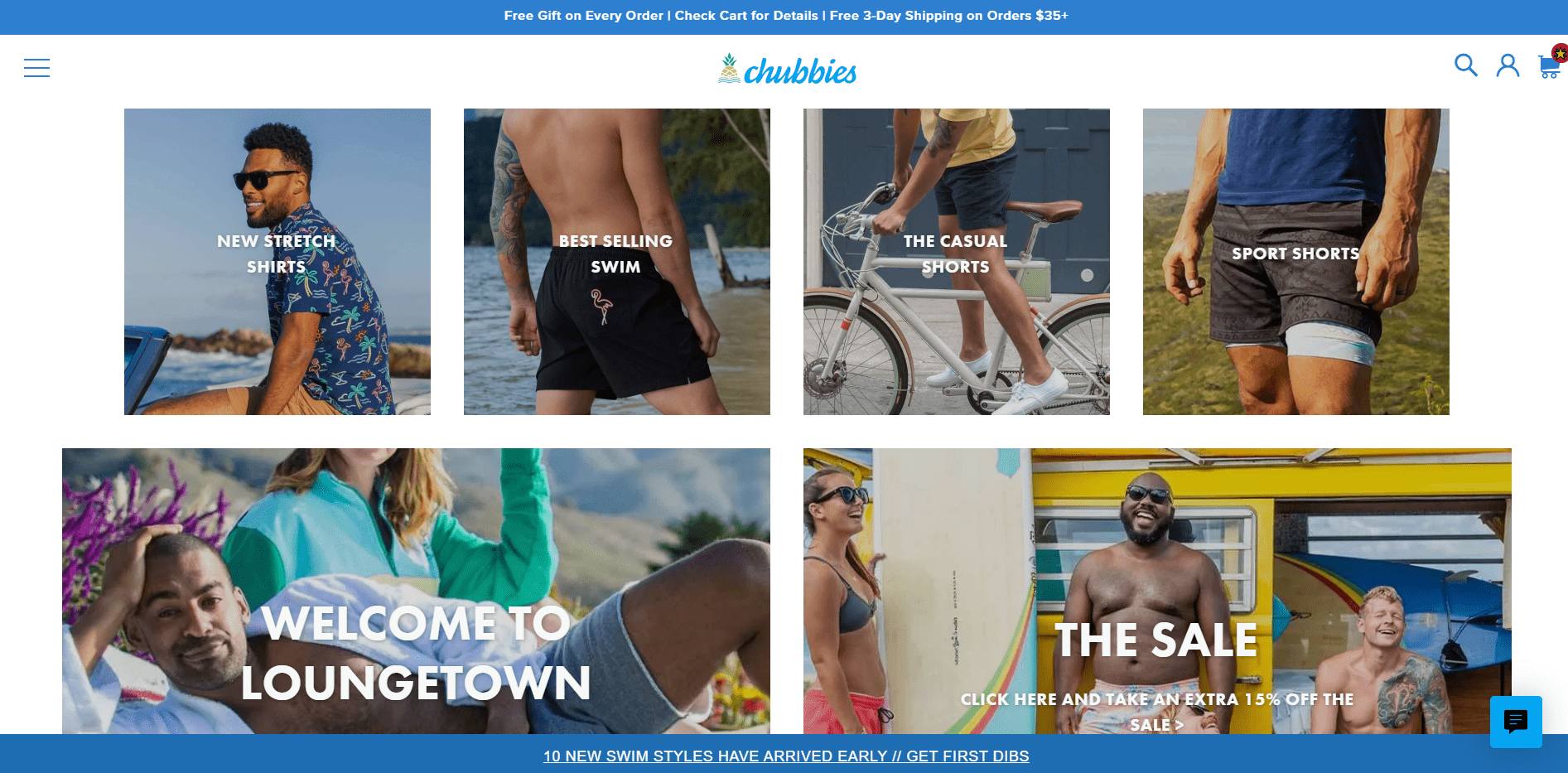
Websites continue to utilize card design, simply because it serves multiple purposes. Naturally, cards are easier to scale for all breakpoints – whether the elements are increasing or decreasing. This eliminates the fear that our designs are not scaling properly on all view ports and devices.
Cards also play into the intentional minimal design principle as they are a contained element that are cleanly and consistently executed, making it easier to pull a user into that piece of content and take proper action to convert.
See below how Chubbies uses card design to layout the homepage of their website:
Clear Call-To-Action
At this point, you've got just about everything else in place. Your call-to-action (CTA) is the most important element on each page. You must provide a highly visible way to entice the user to click and convert.
Every product thumbnail should have a bold “Add to Cart” or “Shop Now” (for configurable products that cannot be added instantly) button to provide as few clicks as possible.
As for your Product Detail page, the CTA button should be prominent in size, above the fold, and a highly contrasted color. Don’t give the user any reason to drop off at the final stages of completing their purchase.
See below how Final Draft uses a clear CTA to encourage users to add this product to their carts:

Painless Checkout Process
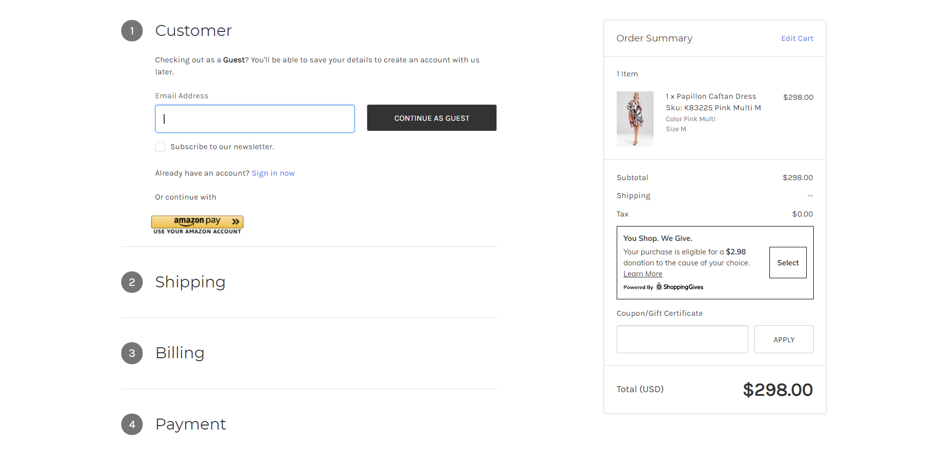
If your website does not implement a one-page checkout for users, it should. A one-page checkout allows users to instantly understand what is required to complete their purchase, with a clear outline of the steps to do so.
eCommerce checkout best practices include a progress bar or design treatment that clearly highlights what steps the user has completed and what needs to be done next. Consumers enjoy knowing how long something is going to take, and seeing their progress aids in their purchase decisions.
In addition, keep the amount of form fields minimal by requiring only the essential information needed to process the order. Providing a confirmation email after the purchase is an easy way to show completion of the order and turn a customer into a repeat customer by displaying promotions and related products.
See below how Natori displays a customer's progress throughout the checkout page:
Conclusion
By following these 5 eCommerce design principles, you'll provide the foundation your website needs to increase conversions. However, it's important to note that these principles alone are not going to provide overnight success.
Continue to look into performance data, and A/B test a variety of site elements in order to drive the proper UX/UI enhancements and further optimize each page for conversion.
If you have any questions about how design is impacting your website's performance, we're here to help. Contact us through the form below with any questions or concerns, and we'll be in touch!

E-BOOK
20 Best Shopify Apps For Your eCommerce Store
Explore tags:
About the author
Subscribe to the Groove Newsletter
Get the latest updates and insights straight to your inbox


