Think about yourself as a consumer. How do you recognize a poorly-designed, overly-cluttered website? Would you purchase from a website that doesn't appear to be trustworthy?
Now, consider your eCommerce website. Is the homepage designed well enough to gain consumer trust? Would you feel comfortable, as a consumer, entering your credit card information on that site?
The homepage is the most important page on any website. It likely attracts the most visitors in comparison to other pages. That being said, it must be optimized to engage different audiences from different backgrounds and encourage conversions without being too pushy.
eCommerce Homepage Best Practices
We're sharing these eCommerce homepage best practices to help decrease your bounce rate, improve engagement, and increase conversions. Be sure to implement the following, if you're not already, into your eCommerce strategy:
- Place key information above the fold
- Display a unique value proposition
- Add enticing calls-to-action
- Include a site search bar
- Design for mobile
Place Key Information Above The Fold
Website visitors either come to your site to shop or to learn something new. But before they become interested - you must gain their attention by proving your value. Using a clean, minimalist design is one great strategy to capture attention and draw a visitor's eyes to your key information.
Users do not want to have to search for the information they're looking for. If they don't recognize the value your brand has to offer right from the beginning, they're going to exit out of your page. That's why it's critical to keep all relevant information above the fold.
Visuals are a great starting point. Including high-quality images or videos is likely to capture a user's attention. In addition, a well-optimized home page with a unique value proposition (UVP) and enticing calls-to-action (CTAs) incentivizes users and guides them towards purchase.
Stand out from the competition by showcasing what makes your brand unique and sharing how customers will benefit from shopping with you.
Display A Unique Value Proposition
When people visit a website for the first time, they want immediate answers to 2 things:
- What does this brand sell or offer?
- How much is it going to cost me?
The unique value proposition must answer these two questions in a simple, yet creative way. UVPs help to decrease bounce rate by encouraging website visitors to explore your site.
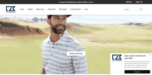
See below how Cutter & Buck strategically placed its UVP at the top of the homepage. Shoppers instantly know that they'll receive free shipping if they spend $50 or more.
Additionally, the pop-up lead generation form encourages shoppers to enter their email to save $15 off of their purchase. This brand offers something of value, and shoppers will recognize that as soon as they land on the homepage.

Although Cutter & Buck's UVP is simple (and effective), it's important to note that a UVP does not always have to be one short sentence.
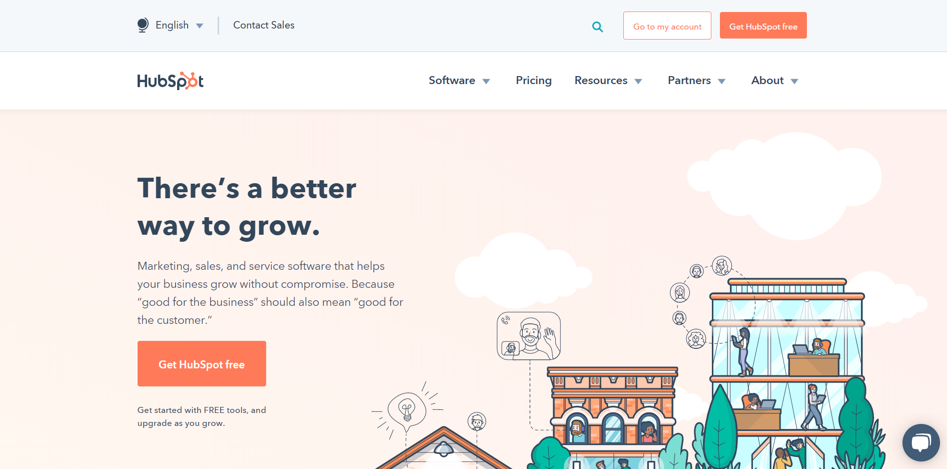
See below how HubSpot incorporates a UVP into its homepage banner. It is easily communicated to website visitors that their brand "helps your business grow without compromise" and considers your brand's customers.

Add Enticing Calls-To-Action
Using CTAs guides shoppers in the direction you want to take them, creating a frictionless movement through the sales funnel. Not only do clear CTAs benefit your brand, they also benefit the customer.
Navigating through a website can be confusing at times - but it shouldn't be. Customers look for CTAs when they're interested in engaging with your brand. These buttons encourage them to take the next step and guide them one step closer to purchase.
The HubSpot example above uses a clear and informative CTA ("Get HubSpot free") that directs users to get started, while informing them that it's free.
The Cutter & Buck example above uses two clear CTAs. Users can either "Shop the Pike" polo shirts or "Sign Up" to to join the mailing list and save money on their purchase.
Include A Site Search Bar
Consumers who use eCommerce site search are some of the most motivated buyers on a website. Typically, these people know exactly what they're intending to purchase and how much they're willing to spend.
Help customers find the products or services they're interested in quickly and effectively by including a site search bar at the top of your homepage. Not only does on-site search benefit your customers, it also benefits your online business.
Increase conversions and improve customer retention by analyzing the keywords customers type in to your search bar. These keywords provide valuable insights into your users' behaviors. You will then have the opportunity to further optimize and improve the site search experience for future shoppers.
Design For Mobile
According to HubSpot, 93% of people have left a website because it didn't display properly on their device. Although the majority of consumers still browse the Internet mainly on a desktop, 24% of consumers browse mainly on mobile.
When you consider the number of purchases made exclusively on mobile devices, mobile optimization becomes inevitable. Be sure your eCommerce website displays correctly and loads quickly for not only desktop but also mobile devices.
Conclusion
We hope we've helped you grasp a better understanding of strategies to increase conversions. Be sure to implement these eCommerce homepage best practices into your web design strategy to improve engagement and increase sales.
If you want to learn more about eCommerce marketing strategies or would like help building and designing your site, contact us through the form below. Our team will be happy to assist you!

E-BOOK
20 Best Shopify Apps For Your eCommerce Store
Explore tags:
About the author
Subscribe to the Groove Newsletter
Get the latest updates and insights straight to your inbox


