Could your landing page designs use some improvement? Although there is no perfect formula for taking your landing pages to the next level, locking down a few best practices helps to create a layout that will easily guide users through the offer and boost conversions.
You likely have plenty of pages on your site to promote your different products. These product pages help to present your items for sale in a positive light to encourage purchases. However, when designing outstanding PPC campaigns, you need to have something more than product pages designed: you need excellent landing pages. The best landing pages will help you turn all your ad clicks into leads and then customers.
A well-designed eCommerce landing page will understand what the person wants to find when they click on the ad. These pages draw people in immediately. Customers feel confident that you have what they need, and they feel strongly motivated to make a purchase. Customers who land on a product page instead of a landing page are as much as 72% more likely to bounce. Effective landing pages feel tailor-made for the customer and create a superior experience.
Building an effective eCommerce landing page
With the right landing pages, you inspire people to make a purchase. They feel they found the product they sought when they started the query. To produce this type of landing page for ecommerce, however, you need to have a strategy that will help you think through all the different elements you will want to include.
Understand your audience
The critical cornerstone of this process lies in understanding your audience. You have to know their motivations when they started their search and what influences their purchasing decisions. Landing page ecommerce should be tailored for people responding to a particular ad, creating a more personalized buyer experience. You reflect this level of personalization in your language, your images, and how you create the entire page. The better you understand your audience, the easier it will be to make all these design decisions.
Avoid distractions
When people land on your page, they should feel as though a giant neon arrow points them towards the ‘buy’ button. You do not want to have them get caught up with other shopping projects or other distractions that will likely result in the loss of a purchase.
Design your eCommerce landing page to have a clear CTA. Let people know what action you think they should take. This eliminates other choices and encourages people to complete the conversion. The best ecommerce landing page examples tell customers precisely what to buy and why.
Do not clutter up the page, either. Keep your text and images streamlined so that everything directs people to make the purchase and helps customers avoid getting side-tracked. You know that different features become prioritized whether you are building your mobile site or email design. The same differentiation occurs for landing pages.
Use social proof or other assurances when possible
Before customers make a purchase, they have a strong desire to know that they are making the best possible choice. Social proof can help you further inspire people to purchase, and it can be a simple aspect to add to your page.
If customers have left you reviews about this specific product, quoting portions of these reviews can be a great addition to your page. Similarly, if you have gotten five stars on one of the various review sites circulating, you can quote that achievement on your landing page.
This portion of the landing page for eCommerce should inspire confidence in the hearts of your leads. When they read the testimonials or see the reviews, they know that your product has met the needs of many customers just like them.
Run tests to further optimize the eCommerce landing page
Landing pages are excellent candidates for A/B testing. With A/B testing, you change one small portion of the page as a test case. The two different versions of the page are then run and shown to different customers. As the two versions of the site run, you can start collecting data about which inspires more customers. While looking at ecommerce landing page examples helps you build your own, A/B testing gives concrete answers about what works for your customers.
To use your A/B testing effectively, you want to choose small site components at a time to check. For example, you might rewrite your call to action to see which people respond better. You might also experiment with details such as the arrangement or placement of photos or the color of the CTA button. The testing can then help you refine your page and see how people respond to changes in these different elements.
eCommerce Landing Page Best Practices
Visitors may land on your website from any page - not just the homepage. That's why it's crucial to optimize your landing pages to be consistent with your brand.
It's a common goal of all eCommerce brands to convert visitors into customers. Utilize the following eCommerce landing page best practices to build customer trust and increase conversions:
- Have clear headlines
- Strategically place your logo
- Use vivid imagery
- Use clear call-to-actions
- Add trust indicators
- Make use of whitespace
- When it comes to form fields, be selective
Have Clear Headlines
Both your advertisement and landing page headlines should be worded and styled consistently to make for a seamless transition between pages. For example, the headline on your landing page should be exactly the same words, color, font and style as the headline in your advertisement. Clear headlines even help to improve your Google Ads score.
See below how this Facebook ad for Chubbies is consistent with the landing page for the swim trunks.
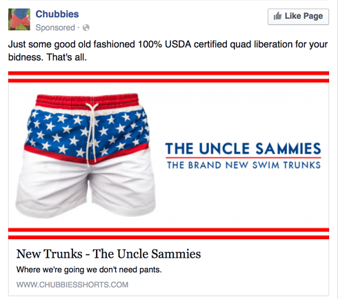
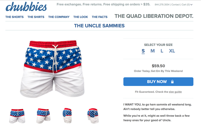
2. Strategically Place Your Logo
This one goes without saying. Strategically place your logo on the landing page so that users know exactly where they have been directed to.
See below how Uber strategically placed its logo in the center of a clean and simple navigation, assuring users that they have been directed to the correct place.
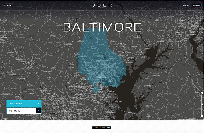
3. Use Vivid Imagery
As humans, our eyes are naturally drawn to visuals rather than text. Implement visuals like images or videos to better explain what your brand has to offer. Using vivid imagery is a great tactic to take place of too much copy on your landing page.
We encourage that you make visual elements a requirement on your eCommerce site. Add value to your landing pages by using visuals that appeal to your targeted customers.
However, only use imagery that relates to the copy. Not only do relevant visuals help explain the offer more efficiently, but they can also push a user to look further into your products or services.
See below how Shopify uses a quick introductory video to share their offerings with site visitors.
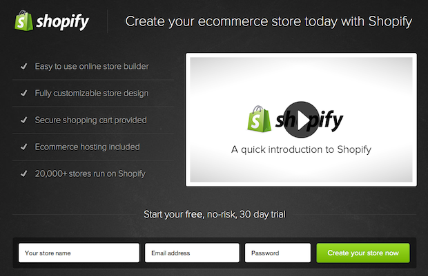
The introduction of a multimedia element, like the video on Shopify’s landing page, is a great way to engage and excite a user.
And if your brand sells products that may be complicated for customers to use, product videos are a great tool. Product videos drive product page conversion and convey information that could have been copy heavy.
Remember to place this imagery in places that will direct visitors to where you want them to go. Consider placing images or videos near your calls-to-actions or forms so that users are more likely to spend more time looking at your site.
4. Have Clear Calls-To-Action
Place your call-to-action (CTA) above the fold and below the right amount of copy to ensure you're providing visitors with the offer at the right time. Be sure to contrast the CTA button so that users can easily find what you want them to click.
See below how Todolist's CTA button stands out from the other elements on its page. The "Get Started - It's Free" button allows for users to easily create an account.
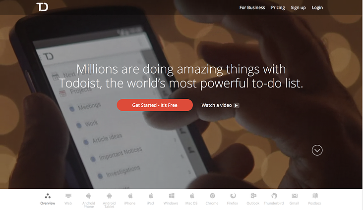
When creating a CTA, be sure to make it stand out by placing it in a location that is easily accessible and effortless for a user to find. Guiding users with CTAs helps them to easily navigate around your site, which decreases your bounce rate.
5. Add Trust Indicators
Including trust indicators/social proof such as testimonials, guarantee seals, awards, third-party security certifications and press mentions provide authenticity to the offer. Trust badges are especially significant on your site's checkout page.
These trust indicators help to establish store credibility and ease consumer skepticism. After all, consumers that do not trust your site will not feel comfortable entering their credit card information.
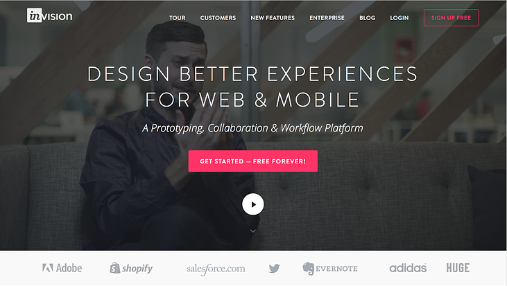
See below how InVision placed their partner logos above the fold so that users see authenticity before scrolling through the rest of the landing page.
6. Make Use Of Whitespace
Use whitespace to your advantage. A landing page doesn’t need to be flashy, and using whitespace can help clearly state the page’s purpose and get to the point of the offer.
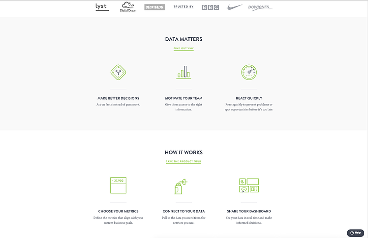
See below how Geckoboard’s body of their landing page utilizes whitespace efficiently. The information is easy to digest as it is spaced out, and the bright green icons and dark gray text contrast well against the whitespace.
7. When It Comes To Form Fields, Be Selective
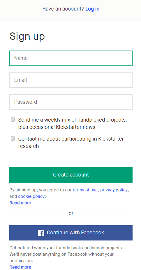
The fewer form fields, the better. You’ll usually get more conversions from a short form rather than a long form. Asking for too much information can deter people from filling out the form at all.
Remember, you don’t need to know everything about the user immediately. Asking for basic information like name and email address is a great place to start.
If you are considering adding more fields to your form, keep in mind that the information you ask for should be worth the value of the content you are offering.
See below how Kickstarter asks minimal questions in the form field and provides the right information without overwhelming the experience.
Conclusion
Although these eCommerce landing page best practices may seem like small steps, together they can achieve great results. We highly recommend designing with the user in mind and A/B testing to ensure your design is accurate and drives potential customers down the funnel.
If you have any questions or are looking to optimize your landing page designs, contact us through the form below. Our Creative Team will be happy to help!
E-BOOK
20 Best Shopify Apps For Your eCommerce Store
Explore tags:
About the author
Subscribe to the Groove Newsletter
Get the latest updates and insights straight to your inbox


