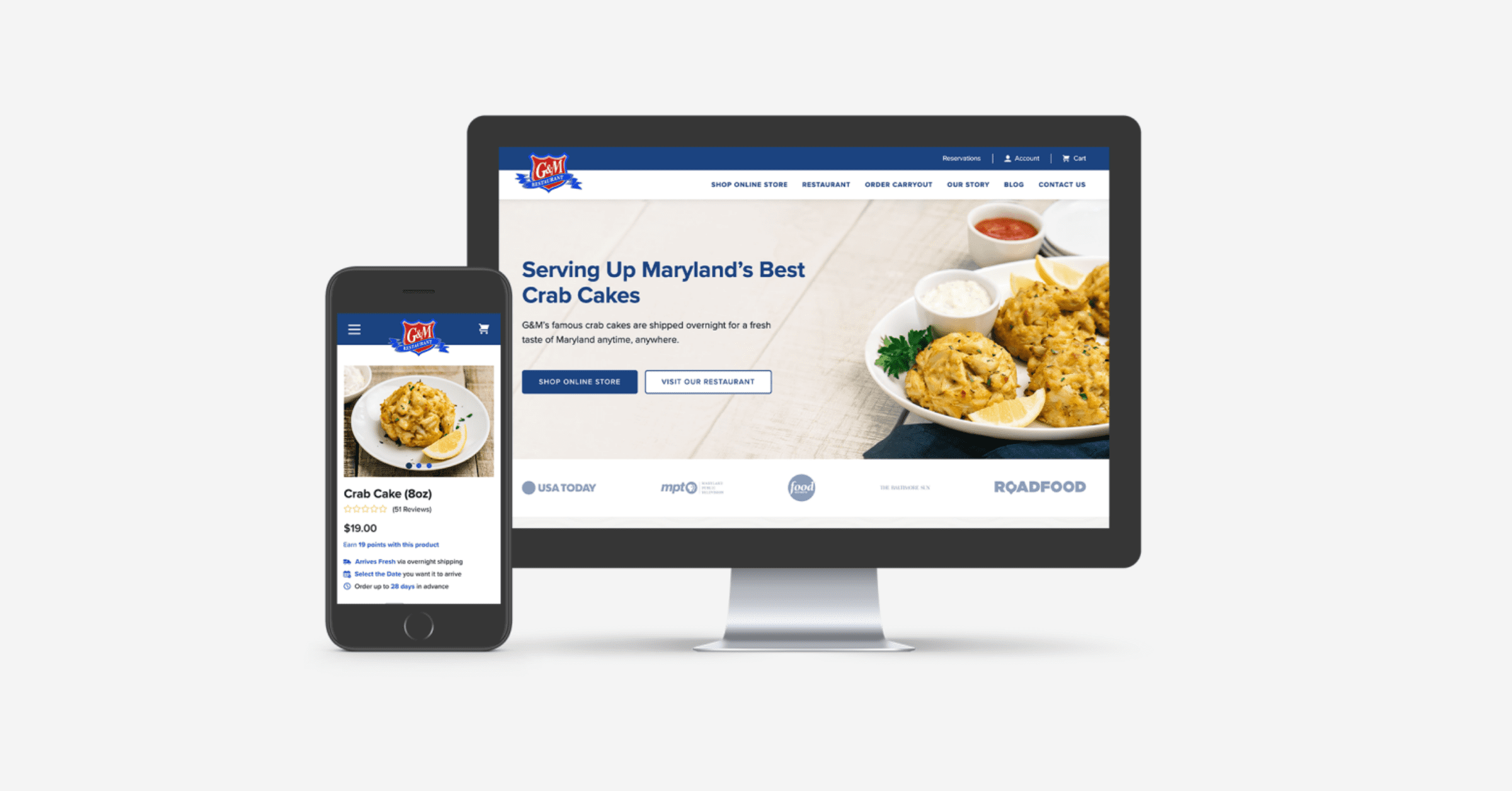
With modern expectations on the rise among online shoppers, many stores must adjust their website design and development to fulfill their customers' needs. In this blog, we're sharing how we helped one restaurant enhance their BigCommerce design and improve the overall eCommerce user experience.
eCommerce User Experience: Reducing Buyer Friction
One of Maryland's most-trusted seafood brands that started as a brick and mortar store in 1974 has grown immensely over the years with exclusive in-room dining and shipping across the United States.
The company enlisted Groove Commerce's help to tackle many challenges that their online store was facing. The website was running on an outdated platform, Magento 1, which assisted in their failing to meet customers' needs. That's when our team stepped in to help.
The Problem
Prior to working with our team, the restaurant faced quite a few issues with their eCommerce store:
- Poor product photography
- No mobile-optimized website
- Many frustrated shoppers
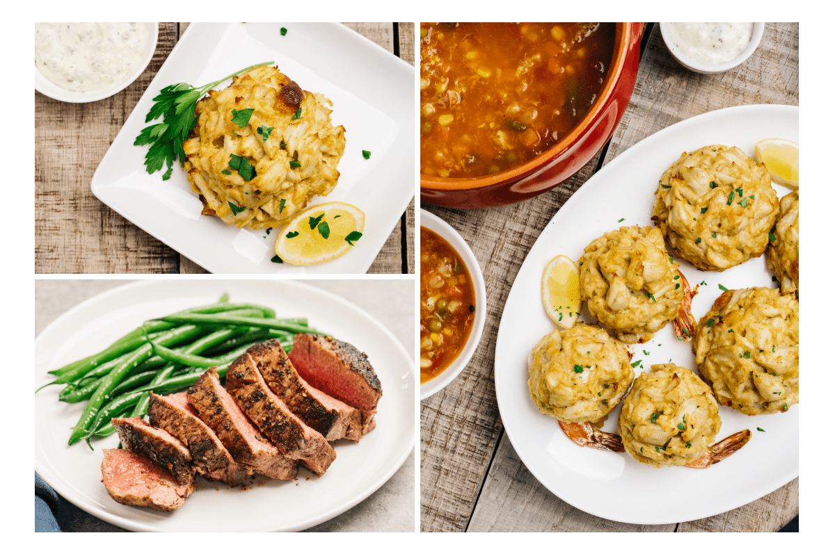
For one thing, the product photography throughout the site needed updating, and they needed a way to make their perishable food items look more appetizing.
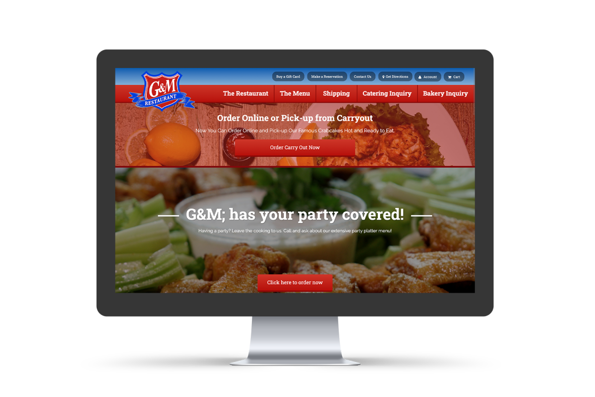
Second, the store was not optimized for mobile, which created a negative user experience for those who like to make purchases on their phones. Also, the website was very heavy from a load perspective, and the design of their Magento 1 store was severely outdated.
Third, buyer frustrations were high due to the difficulty of the checkout process. Customers had a hard time finding the items they were looking for, adding the quantities they needed and converting at checkout.
So, Groove Commerce set out to create high-quality product photography, optimize the store for both desktop and mobile, enhance the company's brand personality, update the site design and eliminate friction in the buying process to improve the eCommerce user experience.
The Website Before Working With Groove
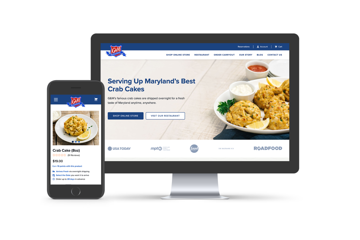
 The Updated Website
The Solution
Use High-Quality Product Photography
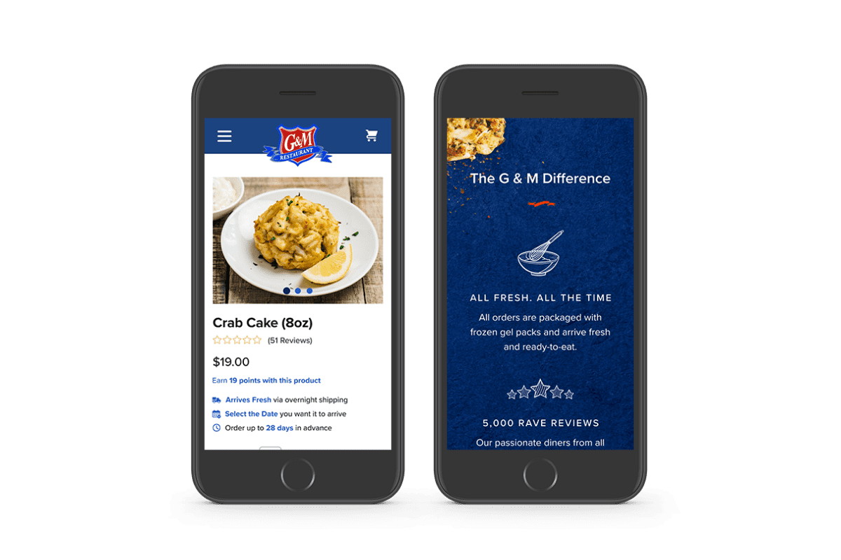
Our team provided the company with photography and art direction to drastically improve the quality of their product photography. This helped to enhance the aesthetics of the site overall, and the photos really made the crab cakes and other food look more delicious.
Optimize The BigCommerce Design For Mobile
We took the company through a comprehensive user experience and wire framing process, which ensured that their BigCommerce design was optimized for mobile as well as desktop.
We focused on creating a personality for the brand because prior to the website redesign, the brand was visually generic in the look and feel. We updated the website design to make the appealing product photography the focal point of the website.
Reduce Buyer Friction By Transitioning To BigCommerce
Additionally, our team helped the restaurant smoothly transition their website from Magento 1 to BigCommerce. We aimed to reduce buyer friction by making it faster for customers to find what they need. We leveraged BigCommerce by building off of the Cornerstone Base Theme. Then, we followed eCommerce best practices and leveraged a multitude of baseline BigCommerce functionality to power the site.
From there, we layered in a custom interface and user experience. The combination of using out-of-the-box BigCommerce functionality and customizing the website's look and feel to work for the client, specifically, is what helped us help the company reduce friction in the purchasing process and enhance the overall eCommerce user experience.
Results
The client's website launched on September 15th, 2020, and we expect the company to see an increase in online sales. The conversion rate increased by 14% compared to their last Magento site, and we anticipate this to rise as the crisp product photography really shows that their brand is trusted and delicious.
Conclusion
If you need help with your BigCommerce design and development or have any questions about how Groove Commerce can help improve your eCommerce user experience, reach out to us through the form below. A member of our team will be in touch soon!

E-BOOK
20 Best Shopify Apps For Your eCommerce Store
Explore tags:
About the author
Subscribe to the Groove Newsletter
Get the latest updates and insights straight to your inbox


