Introduction
In today’s competitive digital landscape, eCommerce email design plays a pivotal role in capturing attention, driving engagement, and ultimately increasing conversions. Well-structured, visually appealing email content ensures that recipients quickly grasp key messages and take action.
With advancements in AI-driven email marketing, dynamic personalization, and mobile-first design, businesses must continuously refine their email strategies to remain relevant. This guide will explore the latest best practices and emerging trends to help you optimize your email marketing efforts while maximizing performance.
Why eCommerce Email Design Matters
Email remains one of the most effective marketing tools for eCommerce brands. With the ability to generate an average ROI of $36 for each $1 spent, email marketing is an indispensable part of any online business strategy. However, simply sending emails is not enough. Design plays a crucial role in ensuring that messages are received, read, and acted upon.
A strong eCommerce email design improves deliverability, enhances readability, and increases conversion rates. With inboxes becoming more crowded, businesses must focus on producing visually engaging content that guides the recipient toward a clear call to action. Emails that are poorly designed or not optimized for various devices can easily be ignored or marked as spam.
Beyond aesthetics, well-designed messages reinforce brand trust and credibility. Consistent use of colors, typography, and layout helps readers recognize and engage with your emails more frequently. By following the best eCommerce email design principles, businesses can create messages that stand out in customers’ inboxes and drive meaningful results.
Core Email Design Best Practices
Keep It at 600 Pixels
The optimal email width has long been established at 600 pixels. This size ensures that messages display correctly across most email clients, preventing layout breakage. With the rise of mobile internet devices, vertical layouts are preferred over horizontal designs, which can introduce readability and formatting issues.
Simple Is Always Better
With the average attention span decreasing, clarity and conciseness are more important than ever. Emails should be easy to scan, with short paragraphs, key points in bold, and strategic use of white space. Using high-quality imagery or embedded videos can boost engagement, but these elements should not overshadow the core message. A single, clear call to action should be the focal point of every email.
Establish a Visual Hierarchy
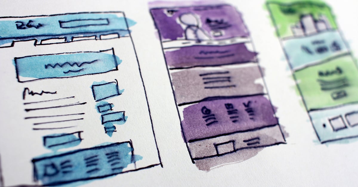
A well-structured message naturally guides readers through the content in a logical sequence. Placing your company logo at the top, followed by a compelling image, a strong headline, and a call to action ensures that recipients can quickly grasp the purpose of the message. Secondary elements, such as supporting text and additional calls to action, should be positioned in a way that does not compete for attention.
Stick With System Fonts
While custom web fonts add a unique aesthetic to websites, they are not universally supported by email clients. For a consistent appearance across different platforms, businesses should use system fonts like Arial, Helvetica, or Georgia. Additionally, with the increasing popularity of dark mode, brands must test font choices to ensure readability under both light and dark themes.
Use Consistent Branding
A strong brand identity should be reflected in every email. Using the same color palette, typography, and logo placement across all marketing materials helps establish familiarity and trust. Email banners can incorporate brand-specific fonts within images, while the body text should stick to system fonts to maintain compatibility.
Advanced Email Design Strategies
Mobile-First Email Design
At least half of all emails are opened on mobile devices, making mobile-first design a necessity. Ensuring that messages are responsive and seamlessly adapt to smaller screens is crucial for engagement. Larger buttons, touch-friendly calls to action, and single-column layouts help enhance readability and usability on smartphones. Consider using a mobile-friendly eCommerce email template.

Personalization & Dynamic Content
Personalization goes beyond adding the recipient’s name to the subject line. Advanced strategies leverage user behavior, purchase history, and real-time data to deliver highly relevant content. Dynamic content blocks create a tailored experience for each recipient. They accomplish this by showing different products, offers, or messages based on user preferences.
Email Accessibility
Accessibility should be a high priority to ensure that all recipients, including those with disabilities, can interact with your emails. Best practices include adding alternative (alt) text to images, using high-contrast color schemes, and choosing readable fonts. Ensuring emails are navigable with screen readers will enhance inclusivity and broaden your reach. Messages should also link to an accessible website; consider using our free accessibility audit to identify any issues.
A/B Testing Best Practices
A/B testing enables a business to refine its email design by analyzing what resonates best with its audience. Beyond testing subject lines and calls to action, companies can experiment with interactive elements, email copy length, and send-time optimization. By leveraging data insights, brands continuously improve performance and maximize engagement.
AI-Powered Email Optimization
Artificial intelligence tools are transforming email marketing by automating content personalization, predicting user behavior, and optimizing send times. Machine-learning algorithms analyze past interactions to suggest the most effective messaging and layouts for different audience segments. Businesses that leverage AI can increase open rates and conversions by delivering content that aligns with user intent.
Common Email Design Mistakes to Avoid
Even with a strong understanding of eCommerce email design, certain mistakes might hinder performance. One common issue is overloading emails with too much content, which can overwhelm recipients and dilute the core message. Emails that rely too heavily on images without alt text may also create rendering issues in certain email clients.
Failing to test messages across multiple email clients can result in formatting inconsistencies that harm the user experience. Likewise, ignoring dark-mode compatibility could cause visibility issues, leading to lower engagement rates. Businesses should also ensure that calls to action are optimized for mobile users by making buttons large enough to easily tap.
How to Measure & Improve Email Performance
Tracking key metrics is essential for refining email strategies. Open, click-through, and conversion rates provide insights into how well a message performs. Heat maps can identify the portions of an email that receive the most engagement, enabling marketers to adjust layouts for better results.

AI and machine learning are increasingly being used to analyze subject line effectiveness, personalization impact, and engagement patterns. These tools help marketers refine their approach based on real-time data, ensuring that each email campaign is optimized to produce the best results.
Conclusion
As eCommerce continues to evolve, brands must stay up to date with the latest email design trends to remain competitive. A well-designed email reaches more inboxes, creates a better user experience, and drives conversions. By implementing mobile-first design, personalization strategies, and AI-driven optimization, businesses can develop high-performing campaigns that boost engagement and revenue.
For expert assistance in optimizing your eCommerce email design, contact Groove Commerce today. Our team specializes in creating impactful, data-driven email marketing strategies and tailoring them to your brand’s needs. Read our case study to see how we helped an eCommerce company boost email-based revenue by 190 percent.

eBook
eCommerce Email Marketing:
The Complete Guide to Skyrocket Growth
Explore tags:
About the author
Subscribe to the Groove Newsletter
Get the latest updates and insights straight to your inbox


