Smartphones and tablets have changed the way we live our lives, and people are increasingly buying the things they need from an eCommerce mobile website. As of the end of 2023, 79% of mobile users have made online purchases using their smart devices.
25+ Best eCommerce Examples
In short, trends in mobile eCommerce are constantly evolving to meet the needs of consumers. For this reason, mobile eCommerce store owners have to stay on top of the latest trends. Be on the lookout for these mobile eCommerce trends in the coming years:
- Mobile app shopping
- One-click ordering
- Social eCommerce
- Voice shopping
- AR and VR
- Omnichannel mobile shopping
- Mobile payments
With this article, we're sharing some of the best eCommerce mobile site examples we could find. The criteria we used to choose which eCommerce mobile websites to showcase are user experience, design, speed, and innovation.
Clothing & Fashion
1. Shinola
With the company's high-end offerings that include watches, leather goods, and exquisite minimalist jewelry, Shinola's customers expect an interface that exudes elegance and luxury. The mobile eCommerce store has the same elegance customers expect from the products.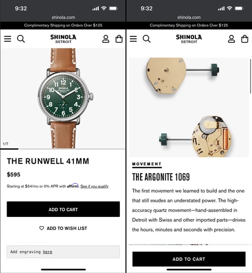
Key features:
- The product detail pages have highlights that are easy to scroll through.
- A sticky add-to-cart on the product detail pages, especially in their eCommerce mobile website design, makes it easy for customers to make quick purchases on their mobile device with ease.
- Product help, such as registration and user managers, are easy to find at the bottom of the homepage.
- A stunning video showing the inner workings of a timepiece graces the top of the page.
Takeaway: If you sell high-end products, be sure your mobile eCommerce sitehas the same vibe and aura as your catalog offerings.
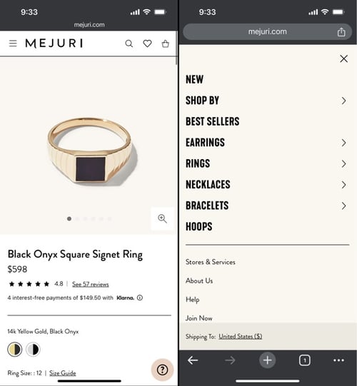
2. Mejuri
Mejuri's mobile eCommerce store leads with an image of a model wearing some of the company's signature pieces. All the product images on the homepage feature jewelry on a white background that makes the products stand out.
Key features:
- Every image on the page offers contrast to make the jewelry pieces stand out.
- It’s easy to navigate to different category pages with minimal clicks.
- A scrolling bar shows the brick-and-mortar store locations, and this info is also in the footer.
- Small touches make the mobile eCommerce website feel like it was designed intentionally for mobile shopping.
- Mejuri values transparency, and the company gives detailed information about its pricing, materials, and sustainability.
- The product detail pages have options for swapping, along with store notifications for when an item is back in stock.
Takeaway: If you have brick-and-mortar stores, be sure to make it easy for customers to find them by including them in prominent places on your mobile eCommerce site's homepage.
3. Cutter & Buck
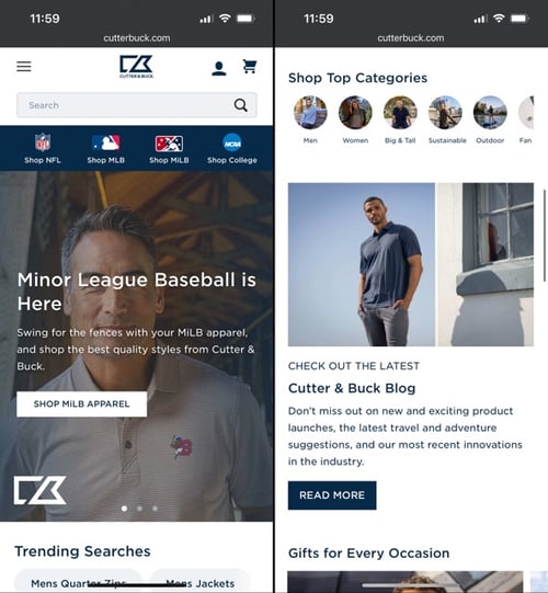
Cutter & Buck has a unique and in-depth understanding of its ideal customer, keeping the sports and teams fans love at the top of their eCommerce mobile site. The company sells sports-themed apparel, including athletic wear and licensed fan favorites.
Key features:
- An exposed search bar makes it easy for high-intent users to navigate the mobile eCommerce site with ease.
- Horizontal swiping for categories makes this site optimized for an intuitive mobile user experience, making this site ideal for searching for trending products.
Takeaway: Keep your core customer in mind with all aspects of your mobile website. Understand that customers know exactly what they're looking for.
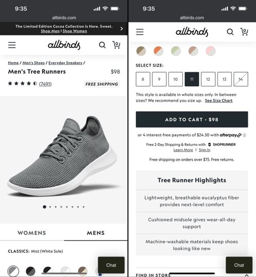
4. Allbirds
The fold doesn't intimidate Allbirds. This brand uses an image of people wearing their shoes to take over the entire screen, making it one of the best mobile website examples on our list.
Key features:
- Favorites are listed directly below the fold, with images of models showcasing the specific products.
- Shoes are categorized by usage (activity, everyday, travel).
- Added functionality on the product detail pages helps reduce clicks.
- New products are prominently featured directly below the fold.
- Horizontal swiping categories directly above the hero image reduces and/or removes the time customers need to find what they need.
Takeaway: Allbirds customers are always interested in the company's new products. Featuring your new offerings will keep your customers coming back to your mobile eCommerce store. Allbirds has a strong understanding of its customer base. The company knows how its customers shop and has built intuitive ways for shoppers to solve their problems on the site with features that are easy to use.
5. Rothy's
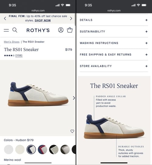
When you visit Rothy's mobile eCommerce site, you're greeted with a carousel header that features a colorful selection of the company's newest shoe style, along with a photo of a model wearing the shoes. The relaxed vibe of the images is in line with the company's overall aura.
Key features of this eCommerce mobile site:
- Photos are styled to show how the products look when worn with casual outfits.
- Horizontal swiping category filtering on the product listing pages makes the site easy to use.
- Extensive customer service options are prominently displayed at the bottom of the homepage, including chat, email, and text options.
- Comprehensive information about the product and cleaning tips are prominently displayed on the product detail page.
- Merchandising on the homepage is curated for trending products and fan favorites.
Takeaway: Rothy’s mobile eCommerce site has a balance of form and function, and the site feels like it was built with mobile shopping as its first priority. For fashion products such as shoes or bags, consider displaying them as styled photos to give your customers an idea of how they look.
6. Blundstone
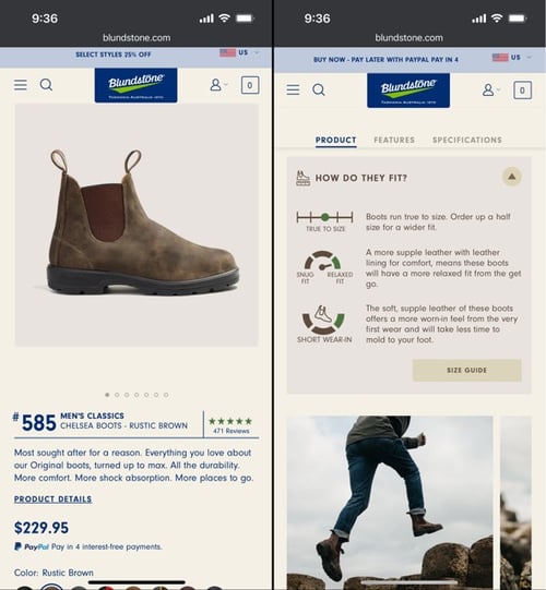
Blundstone sells one product—boots—and they do it better than almost anyone in their niche industry. While the company sells just one signature style of boots, they offer boots for women, men, and kids. The mobile eCommerce site makes it easy to shop for either men or women.
Key features:
- The company's story is on the homepage, which makes customers feel connected and like they're a part of the journey.
- News stories about the boots are featured front and center, adding credibility to the company's claims of quality and versatility.
- The use of photos in the navigation menu makes it easy for customers to see what they want.
- Sizing and fit descriptions are prominently displayed on the product detail pages.
Takeaway: If you sell only one thing, show all the ways that product can be used or worn. For example, Blundstone shows people wearing the company's boots for outdoor adventures, running errands, work, and more.
Sports & Outdoor
7. Penny Skateboards
The best mobile eCommerce sites make good use of space, and Penny Skateboards does that beautifully. A stunning lifestyle photo with the company's slogan is the first thing users see when they visit the company's mobile eCommerce store.
Key features:
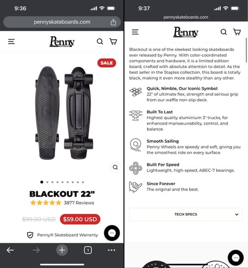
- Items on sale are directly below the fold.
- A size guide on the homepage gives customers a clear view of the various options.
- Value propositions such as fast shipping and warranty are included on the homepage of the mobile site.
Takeaway: Give customers the info they need up-front. This is especially important with products that come in different varieties and sizes.
8. Huckberry
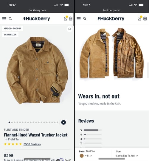
Huckberry's aim is to be a one-stop travel shop for adventures with wanderlust. The top of the page has a carousel showcasing the company's motto, along with style guides and new products.
Key features:
- New arrivals are shown at the top, just below the fold.
- The left navigation menu collapses for ease of use. Moreover, the menu lists individual items, so customers can quickly jump to the section they need.
- Huckberry is a lifestyle brand, and the mobile site has content useful for customers, including TV episodes and style guides.
Takeaway: Lifestyle brands like Huckberry benefit from having extra content easily accessible from their homepage. Consider blog articles, style guides, gear lists, or videos. Mobile eCommerce sites that follow these guidelines greatly increase their chances of success.
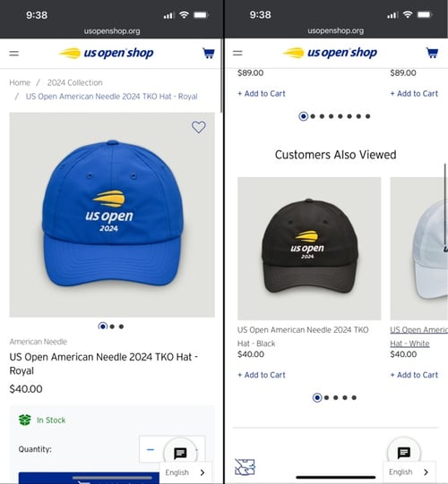
9. US Open Shop
As an official eCommerce site for a sports organization, the product offerings at US Open Shop are straightforward.
Key features:
- Sections on the navigation menu are clearly divided into men's, women's, and kids' products.
- The upsell area on the product detail pages increases sales and helps customers find related products they will find useful.
- Stock notifications and returns information is prominently displayed on the product detail pages.
Takeaway: The US Open mobile eCommerce site is easy to use. Moreover, the site ensures credibility, so customers feel confident that they’re buying licensed products.
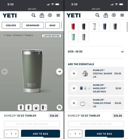
10. Yeti
Yeti is a brand that needs little introduction, so the mobile website gets straight to the point. The carousel images at the top of the page show individuals enjoying their beverages outdoors.
Key features:
- A chat option for customer support is directly on the homepage, so customers can get quick answers to questions.
- Another carousel underneath the header images shows all the company's various products in lifestyle images.
- A third carousel features colorful Yeti products against a stark white background.
- The detail pages have upsell options, along with a sticky add-to-bag.
Takeaway: Some customers respond to lifestyle imagery, while others like to see the color of the mugs against a white background. Yeti caters to the shopping aesthetic of every customer. Consider styling your own images to appeal to different types of shoppers.
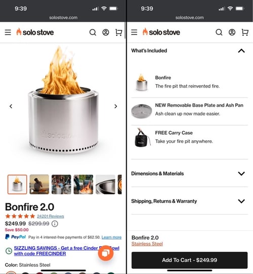
11. Solo Stove
Solo Stove sells products for people who enjoy cooking outside and spending time outdoors, and the website's aesthetic reflects that lifestyle. The top of the page features deals and specials such as a free cinder.
Key features:
- The contact information is shown in the footer. Solo Stove includes phone and text numbers, along with a physical address.
- Searching the mobile site is easy.
- Callouts for promotions offer an incentive for shoppers to both shop and stay on the site for longer.
- Product categories are accessible either from the homepage or the pull-out side menu.
- Horizontal scrolling on product feeds makes the mobile eCommerce site intuitive.
Takeaway: Including contact information that connects customers directly to a person demonstrates that the company is accessible. Customers value being able to easily find contact information easily on a mobile eCommerce site.
Food & Beverage
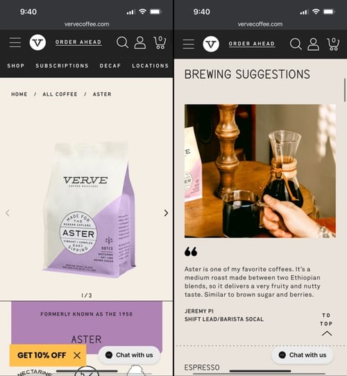
12. Verve Coffee
Verge Coffee caters to coffee drinkers who want to upgrade their coffee routine. The company offers a subscription option, and the mobile eCommerce store shares this information in a few places on its homepage.
Key features:
- The most popular flavors are directly below the subscription information.
- On the product detail pages, photos change colors, so the page is engaging for site visitors.
- Easy-to-use subscriptions on the homepage encourage customers to sign up for monthly deliveries.
Takeaway: If you sell a consumable product, consider offering a subscription service to encourage repeat customers. Be sure this info is easily accessible on the homepage of your mobile site. Verge makes it easy to subscribe to monthly coffee deliveries. Because subscriptions increase sales and encourage repeat customers, making it easy for customers to subscribe is key.
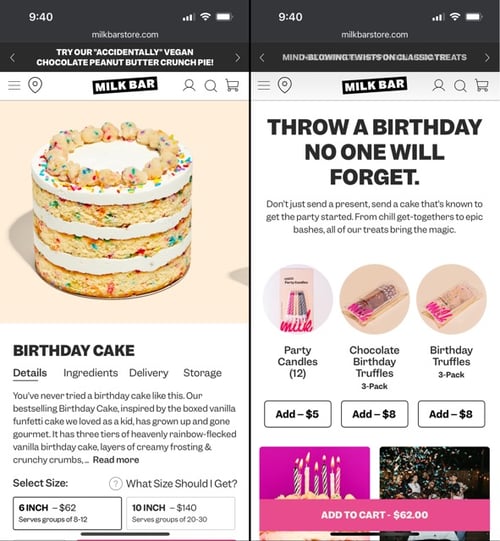
13. Milkbar
Milkbar shows mouth-watering images of their delicious treats at the top of its mobile eCommerce website. The company ships nationwide, and this info is visible directly underneath the top photos.
Key features:
- Milkbar has won awards for their desserts, and they make sure their customers know that when they visit the website.
- The company shares photos of its bakers, which increases the credibility of these one-of-a-kind homemade treats.
- On every product page, there is a navigation menu below the photo of the dessert. This menu has pull-out tabs sharing information about ingredients, delivery, and storage. The pull-out tabs keep customers on the page.
Takeaway: Sellers of food need high-quality photos that make their customers eager to buy. Equally important, sharing photos of the products being prepared makes the customer feel that they're getting something made especially for them.
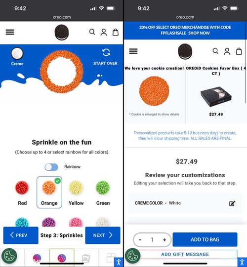
14. Oreo ID
Oreo ID allows customers to create their own custom version of this classic cookie. The mobile website has clear visuals and easy navigation.
Key features:
- Oreo's mobile eCommerce site has beautiful visuals, with colorful sprinkles and a variety of treats.
- The company makes use of multimedia, with a video featured prominently on the homepage.
- Oreo is well-known for its strong social media presence and content. Links to the company's social media account are placed clearly on the homepage.
Takeaway: If you sell customized foods, be sure to design your mobile eCommerce store with easy step-by-step ordering. By taking notes from mobile web examples like Oreo, you will find inspiration to improve your own site.
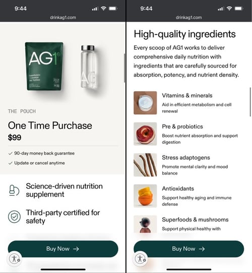
15. Athletic Greens
Athletic Greens (AG1) sells a nutritional drink designed to cover gaps in nutrition with a comprehensive blend of nutrients.
Key features:
- The company's money-back guarantee is shown directly below the buttons to start using the product or take a quiz.
- The homepage has a lot of information about the ingredients.
- All the benefits of taking this supplement are listed and explained on the homepage.
- Study results are displayed, which lends credibility to the product.
Takeaway: If you sell nutritional products, display the science behind your products on your mobile site's homepage so your customers know what they're getting. People who buy these products are health-conscious and want lots of information about the supplements they take.
Home & Gifts
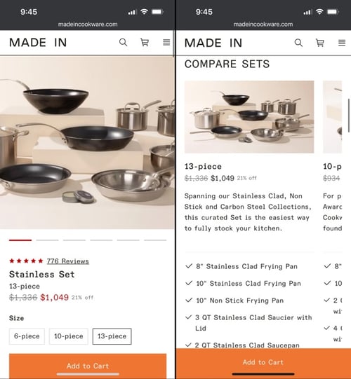
16. Made In
As one of the most sought-after brands of kitchen cookware, Made In, wants website visitors to know right away that they have more than 100K 5-star reviews.
Key features:
- Full transparency is visible directly under the fold, with customer reviews easy to access for mobile website visitors.
- The homepage includes information about the company's long history.
- Imagery shows the products in use, along with chefs using the cookware.
Key takeaway: Companies with a long history and lots of reviews can use this as social proof directly on their homepage.
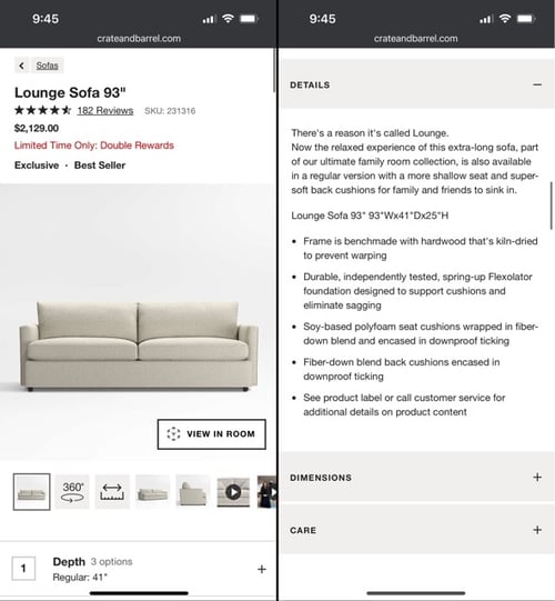
17. Crate and Barrel
Crate and Barrel has a huge product catalog, and the pull-out side menu saves space on the homepage.
Key features:
- All product imagery is styled to show how the item will look in a home setting.
- The company's casual vibe of effortless chic carries over into the mobile eCommerce store.
- Buttons on every section on the homepage allow shoppers to jump directly to that section.
Takeaway: Companies that have a large product catalog will benefit from the pull-out side menu so customers don't have to scroll over a long navigation bar. Also, be sure your company's vibe is reflected in the website design.
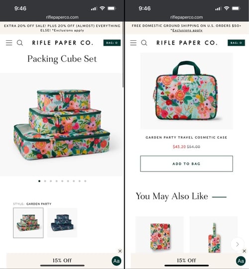
18. Rifle Paper Company
Rifle Paper Company started with stationery products for a home office, but the company has expanded with a full line of furniture and home decor items.
Key features:
- To make sure customers know the company is more than just paper goods, they put photos of their home decor items at the top of the page with a styled photo of a colorful photo underneath.
- Bestsellers are featured in a carousel directly below on the field.
- On the detail pages, images are present for variant options so users can choose the right option for them.
Takeaway: Bring the aesthetic of your company into your mobile website. Bright colors entice people to buy the type of products this company sells.
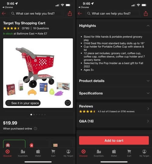
19. Target
Most of Target's customers shop at their brick-and-mortar superstores, but shoppers are increasingly ordering goods on the company's website.
Key features:
- The header bar offers easy access to shipping options for the customer's area, along with a link to find stores near them.
- Most of the homepage is dedicated to items on sale.
- One-click add-to-cart buttons for items that are popular on social media make it easy for customers to shop quickly for trendy items.
Takeaway: Stores that sell a wide variety of items can benefit by making sure customers know what's on sale. Putting this info front and center encourages buyers to add to their carts.
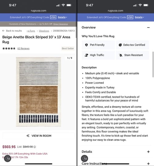
20. Rugs USA
Rugs USA is more than just a web-based and mobile eCommerce store selling rugs. Many of the company's artisan rugs were made in collaboration with designers, and the company wants its customers to be aware of that. For this reason, the designer collaborations are featured at the top of the mobile website's homepage.
Key features:
- Rug sizing information is shown in a detailed image, making it easy for customers to get the exact size they need.
- Sections for different types of rugs are pictured in a grid, so customers can easily jump to the section for the rug they need.
Takeaway: Working with designers or artisans can be a unique value proposition for companies selling either on the web or via a mobile eCommerce store.
Beauty & Wellness
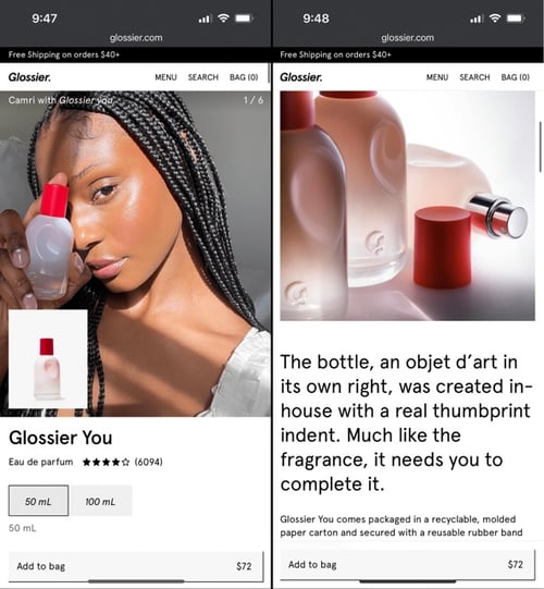
21. Glossier
Glossier makes the most of the limited screen on mobile devices by putting its top-selling products at the top. The logo and menu bar are tiny but large enough for customers to access as needed.
Key features:
- Search is built into the navigation menu, saving valuable real estate for featuring products.
- Color palettes are shown below the product, allowing the customer to jump quickly to their favorites.
Takeaway: If your products come in variations such as colors or sizes, make it easy for your customer to jump straight to their favorites directly from the homepage of your mobile eCommerce website.
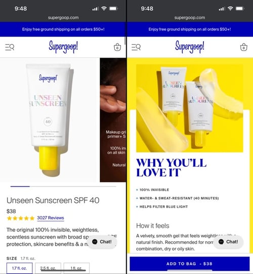
22. Supergoop
Skincare and protection from the sun's harsh rays are what Supergoop is all about, and the company offers more than 40 "feel-good formulas" to meet the needs of any individual.
Key features:
- Information about the importance of sun protection is at the top of the homepage.
- The company uses scientific information, such as how sunscreen can protect against 90% of the signs of aging.
- Brightly colored imagery makes this site fun.
- The company uses multimedia, such as videos of how creamy their product is.
Takeaway: If you sell one product, you can showcase the product and make your mobile eCommerce website more robust by using multimedia.
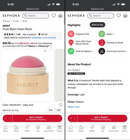
23. Sephora
Beauty is Sephora's bread and butter, and they serve up popular beauty products to people of all ages. For this reason, having consistency in both mobile and eCommerce stores is essential.
Key features:
- The eCommerce mobile website directly mimics the web version, providing customers with a familiar interface.
- The handy bottom navigation menu allows users to jump directly to whatever section of the mobile site they need.
- The mobile eCommerce website has built-in location functionality so users can find the brick-and-mortar store nearest to them.
Takeaway: If you serve more than one demographic, consider ensuring your mobile eCommerce website is very similar to the web-based version of your website.
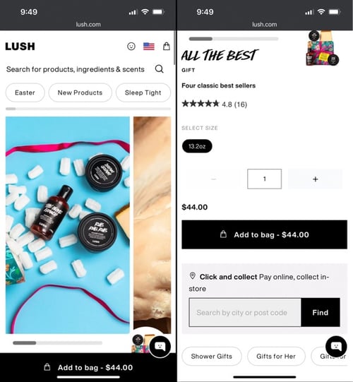
24. Lush
Lush stands out by capitalizing on all things visual. The mobile eCommerce website has a seamless feed with stunning images featuring the company's most popular products.
Key features:
- Simple navigation with trending products, holiday gift ideas, and new items are front and center.
- Robust search functionality allows customers to find exactly what they need.
- The company uses a product-first layout.
Takeaway: Make your products the star of the show and invest in high-end photography.
25. Drunk Elephant
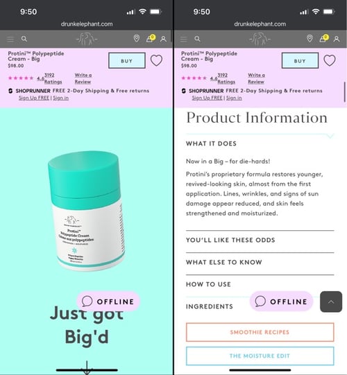
The Drunk Elephant site may be one of the top eCommerce sites because of its fun, vibrant color scheme. They use evocative language to make the mobile website's vibe more engaging.
Key features:
- The free shipping option is the first thing visitors see when they navigate to the website.
- In addition to sharp product images, the website also employs the use of evocative phrasing.
- In addition to product offerings, the slide-out side menu has links to the company's philosophy, a smoothie glossary, and an online magazine.
Takeaway: Companies that offer one product line can benefit from using engaging media and freebies such as recipes for healthy living.
26. Ritual
A company that sells supplements, Ritual focuses on science-backed information and has scientists who study genetics and diet. The company's website makes it clear that they're not about pseudoscience.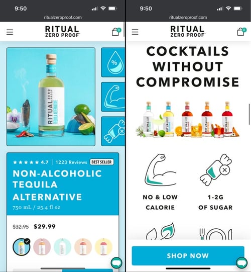
Key features:
- The ingredients for Ritual's products are vegan, non-GMO, third-party tested, and traceable. They want to be sure the customers know this up-front.
- Ritual has been reviewed by publications such as The New York Times and Vogue. Links to these media mentions are on the homepage.
Takeaway: Businesses in the supplement industry have a lot of competition. You can stand out by highlighting your ingredients and science-based products.
Summary of the Top eCommerce Website Examples
The key to being on the cutting edge of mobile eCommerce is to innovate and experiment, trying a variety of different mobile eCommerce strategies.
Do you have questions about how you can transform your mobile eCommerce store into one of the best shopping experiences? Contact us to learn more about how our eCommerce Website Design team can enable you achieve all of your business goals.

eBook
eCommerce Website Design Elements To Increase Conversions: The Definitive Manual
Explore tags:
About the author
Subscribe to the Groove Newsletter
Get the latest updates and insights straight to your inbox


![Top 25+ eCommerce Mobile Site Examples You Can Learn From [2025]](https://www.groovecommerce.com/hubfs/2023%20Website/Blogs/Top%2025%2B%20eCommerce%20Mobile%20Site%20Examples%20You%20Can%20Learn%20From%20%5B2024%5D/eCommerce%20Mobile%20Site%20Featured%20Image.jpg)
