So, you've spent a considerable amount of time shopping around on an eCommerce website and adding things to your cart. You get to the checkout only to find out you're required to create an account to continue making your purchase. Who wants to do that?
Optimizing a mobile shopping cart design is a critical component to not only creating a positive user experience but also reducing shopping cart abandonment and capturing revenue.
Mobile Shopping Cart Design: 5 Optimization Tips
In this blog, we're sharing tips on how to optimize your mobile shopping cart design:
- Have one clear CTA
- Include a detailed product summary
- Optimize thumbnail images
- Prove your site is secure
- Include related products
1. Have One Clear CTA
When a user arrives on the shopping cart, it should be very obvious what the next step is. That's why it's important to use one clear call-to-action (CTA) so that users are directed to where you want to take them. Avoid using multiple, competing CTAs.
Consider visual hierarchy, or the order that a website visitor processes and views the information on your web page. People typically read from top to bottom on mobile, but you can influence the way in which they absorb your information. Use different visual characteristics, like a bold CTA button with large font, to attract a user's attention to where you want to lead them.
2. Include A Detailed Product Summary
Many times, carts become abandoned due to a lack of information provided by the seller. Improve your abandoned cart rate by providing customers with a detailed product summary prior to entering their payment information.
Include the official name of the product(s), size (for apparel), color, quantity, price and relevant details such as features, memory, etc. so that customers can seamlessly review their order and check for any discrepancies.
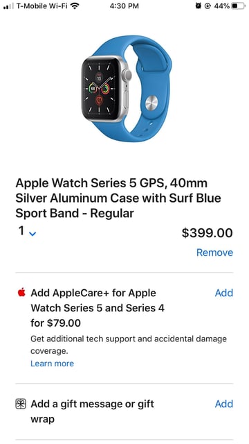
See below how Apple's mobile shopping cart design shows a bold product description with a detailed summary at the top. They placed the add-on protection copy and CTA in the middle of the page, with the (less important) gift wrap and CTA at the bottom of the cart.

3. Optimize Thumbnail Images
Be sure to show your customers images of the products they're about to purchase in the detailed product summary. Large, high-quality images help customers to immediately identify the product they're about to purchase.
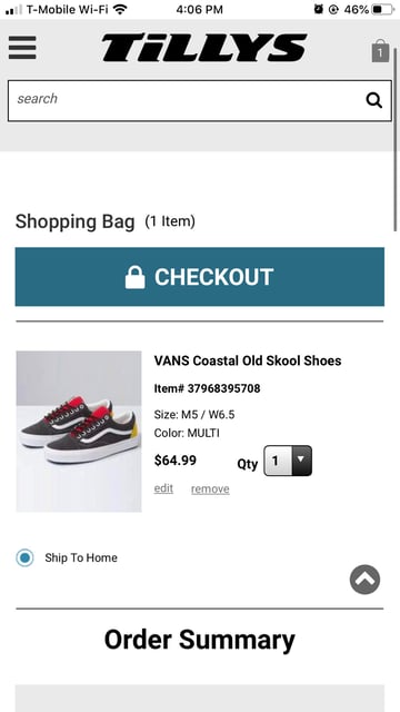
Tilly's mobile shopping cart design includes a high-resolution image of the Vans shoes in this customer's shopping cart. It helps to remind the customer of the item they're buying and what that item looks like.

4. Prove Your Site Is Secure
Including this eCommerce checkout best practice is critical to increasing conversions. Cybersecurity issues and online scams are still an existing threat to websites, which is why employing security assurances is beneficial.
Not only will site security increase your store's credibility and protect its privacy, but it will also establish consumer trust and confidence in your brand. Showcasing security badges or logos prior to checkout will ease any skepticism consumers may have prior to entering personal information.
5. Include Related Products
Presenting shoppers with additional products related to the primary product in their mobile shopping cart allows them to easily add items to their order before converting. This helps to increase average order value, which means more profit for your eCommerce store.
To effectively cross-sell, you must evaluate product relationships and determine which items make sense to cross-sell with the products consumers are adding to their shopping carts. Successful cross-selling occurs when customers don't hesitate to add a related product to their cart.
Conclusion
We hope these 5 tips help you to optimize your mobile shopping cart design and keep up with mobile trends. Remember, your customers should feel confident in purchasing from your brand. Build that trust by utilizing clear CTAs, high-quality product images, detailed product summaries, security assurances and cross-sells to guide customers on the path to conversion.
If you need help with eCommerce website design, Groove's design team is here to help elevate your brand. Contact us with any questions or concerns through the link below, and we'll be in touch!

E-BOOK
20 Best Shopify Apps For Your eCommerce Store
Explore tags:
About the author
Subscribe to the Groove Newsletter
Get the latest updates and insights straight to your inbox


