From beautiful photo-centric sites to movement and interactivity, the past few years have shown several ways to be bold, minimal and everything in between.
Some may argue that extra visual elements may be distracting from what’s really important. These elements may not die, but rather they'll become more subtle and gently factored in where necessary to enhance a website.
UI Design Trends for 2020
2020 will go for that same bold factor, but in different ways. The user interface makes all the difference in how users interact with a site. User interface design will be more simple, subtle and to the point.
With this in mind, we're sharing some of our favorite UI design trends for you to watch out for this year:
- Flat UI
- Minimalism
- Brutalist
- Complex Gradients
- Video
- Illustration
Flat UI
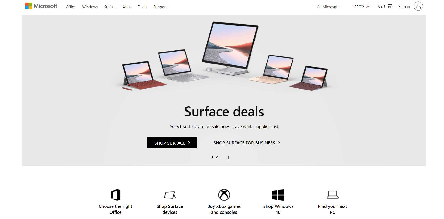
Lately, user interface design has grown to be simple and straightforward. Flat design is really about letting the content speak for itself.
With a flat user interface, the design consists of two layers:
- one top layer that houses contextual elements
- one bottom layer with a flat, solid background color
Flat UI lends itself to transition easily to any size because it’s simple and can be reshaped in a different way to still follow the same order of information. In most cases, simplicity is key.
See below how Microsoft uses a flat UI design to showcase simplicity:
Minimalism
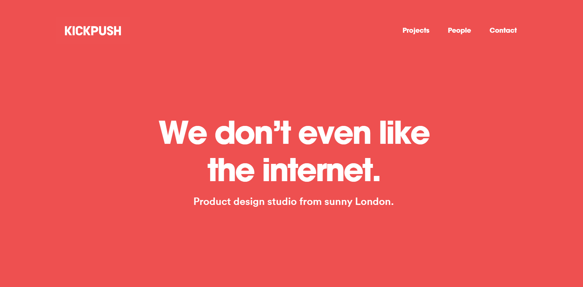
We continue to see less clutter on websites. A minimal design demands a very limited palette, which means that every element needs to be strong on its own.
Minimal sites are clean and light, with lots of breathing room and purposeful use of negative space. An advantage of having a minimal design is the reduction in page weight and loading time — especially while shopping online.
See below how Kickpush uses minimalism on its homepage:
Brutalist
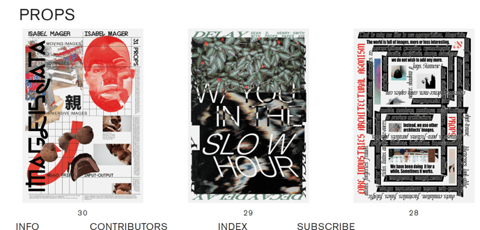
While minimalism is still going strong, there seems to be an emergence of something completely different, called brutalist design. Popular in Europe, this design takes everything that minimalism stands for and flips it on its head.
It utilizes complex color schemes and chaos and completely ignores the rules of balance and harmony. Keep your eye out for more and more website designs that challenge traditional design ideals.
See below how PROPS Paper Magazine uses a brutalist UI design trend on its homepage:
Complex Gradients
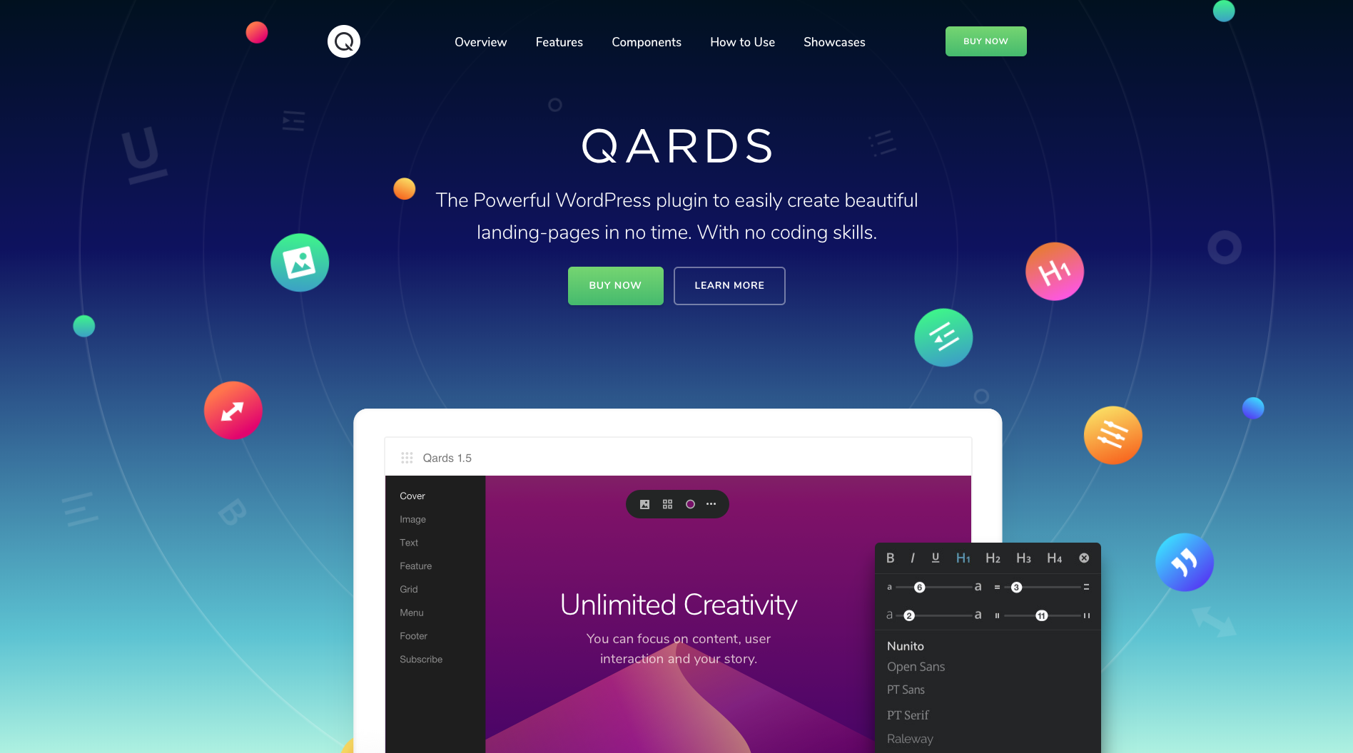
Gradients have officially made a comeback. The true power of gradient lies in its versatility across a website's landscape.
Use gradients within your calls-to-action, navigation, background, illustrations, and well, anywhere really. They create depth and distinction between different elements on your site, while also creating a cohesiveness between them.
See below how QARDS uses a gradient on its homepage:
Video
Why read when you can watch? We’ve started to see large background imagery take over homepages and backgrounds.
Video is going to take over most homepages around the web. It’s is a great way to quickly deliver content, tell a story and make an impact in a matter of seconds. People want to see a taste of what they’re looking for.
In addition to videos on homepages, eCommerce product videos help brands showcase their products in the best way possible. Be sure your website is utilizing videos where necessary to turn shoppers into customers.
Illustration
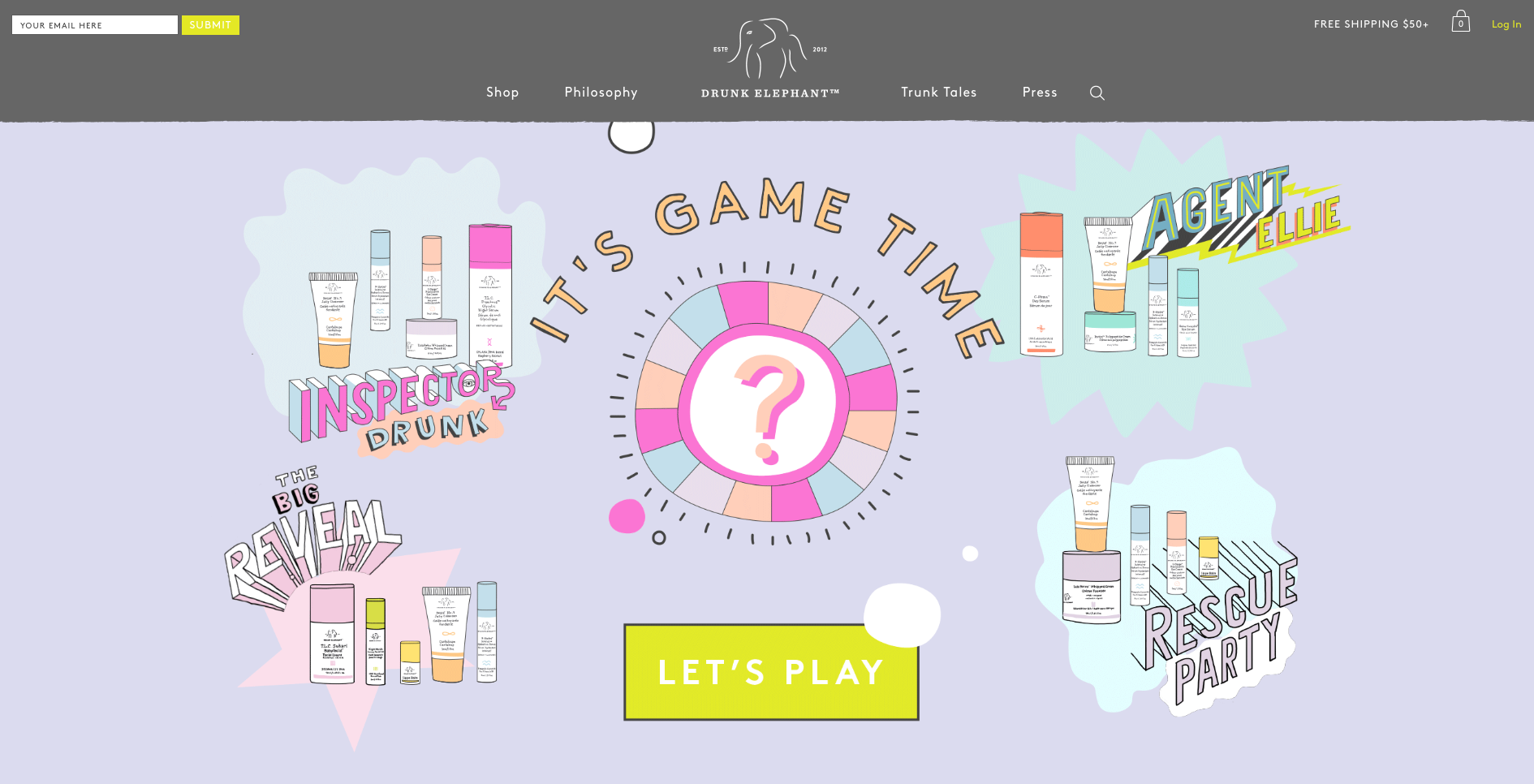
There are many different illustration styles that have burst onto the graphic design scene. Illustrations on a website may seem contradictory, but in fact, they give a human element to the virtual world. Seeing a "hand drawn" illustration is refreshing, intriguing, and presents products in a new way.
See below how Drunk Elephant utilizes illustrations on its home page to capture visitors' interest:
Conclusion
As responsive designs become the norm for how websites are built, we'll see more designs sharing a mobile-first mentality. Designers and developers will continue to collaboratively put effort into making websites look and work better to create a positive user experience.
Staying up to date with UI design trends is a critical component of any eCommerce strategy. Although we don't recommend implementing every trend you see, awareness and understanding of them are important to keep your site up to date.
Looking for a team of eCommerce Designers to help you improve your store? Learn more about what we do, and if the the eCommerce Website Design services we offer are right for your brand. We'd love to help bring your ideas to life!

E-BOOK
eCommerce Website Design Elements To Increase Conversions
Explore tags:
About the author
As a Developer and blogger, Joe McElroy covers a wide range of eCommerce topics. They share their thoughts on everything from product front-end to back-end development.
Subscribe to the Groove Newsletter
Get the latest updates and insights straight to your inbox


