Cutter & Buck

Revenue
Average Order Value
Conversion Rate
How UX Increased This Fashion Brand’s Conversions by 281%
Cutter & Buck is an active lifestyle fashion brand with a focus on both D2C and B2B merchandising.
After initially partnering with Groove Commerce in 2015, our team maintained and eventually migrated their locally-hosted Magento 1 instance to BigCommerce. After completing that migration in 2017, our team supported and optimized Cutter & Buck's website. However, we identified that larger strategic UX and UI improvements could lead to measurable performance increases.
The Challenge
Unengaged Users
To begin this process, our team conducted a comprehensive UX and UI audit to better understand how users interact with the site. Part of the site audit process includes conducting both scroll map and click map tests. The scroll map test allows our strategy and creative teams to view how far a website's visitors scroll down a page. Similarly, a click map test shows how frequently users interact with certain items on a page.
As shown in the graphic below, only 50% of users scrolled “below the fold” of the homepage, with most visitors not making it past the hero image. This trend held true on mobile devices, with users slightly more willing to take at least one swipe down the page.
Lack of Content Modules
After initially reviewing home page test results, the Groove Commerce team looked at the other high value pages for Cutter & Buck. These pages included their Fan Shop pages, Collections pages, Product Listing pages, Product Detail pages, as well as the Cart/Checkout pages.
During this analysis, we found that while most users viewing the Fan Shop pages had no issues finding the team they were looking for, there was a significant opportunity to insert content rich modules below the team listings.
Ineffective Site Elements
After completing our scroll map analysis, we analyzed results from the click map test.
This revealed that on desktop computers, menu items for “Men” and “Ladies” were the most-clicked items, with the search bar close behind. The observation held true for mobile users, who typically headed straight for the “Hamburger Menu” to access search functionality or to select the category of clothing they are looking for.
These insights gave us invaluable information about what site elements should stay, what could be improved and what site elements needed to be removed.
The Solution
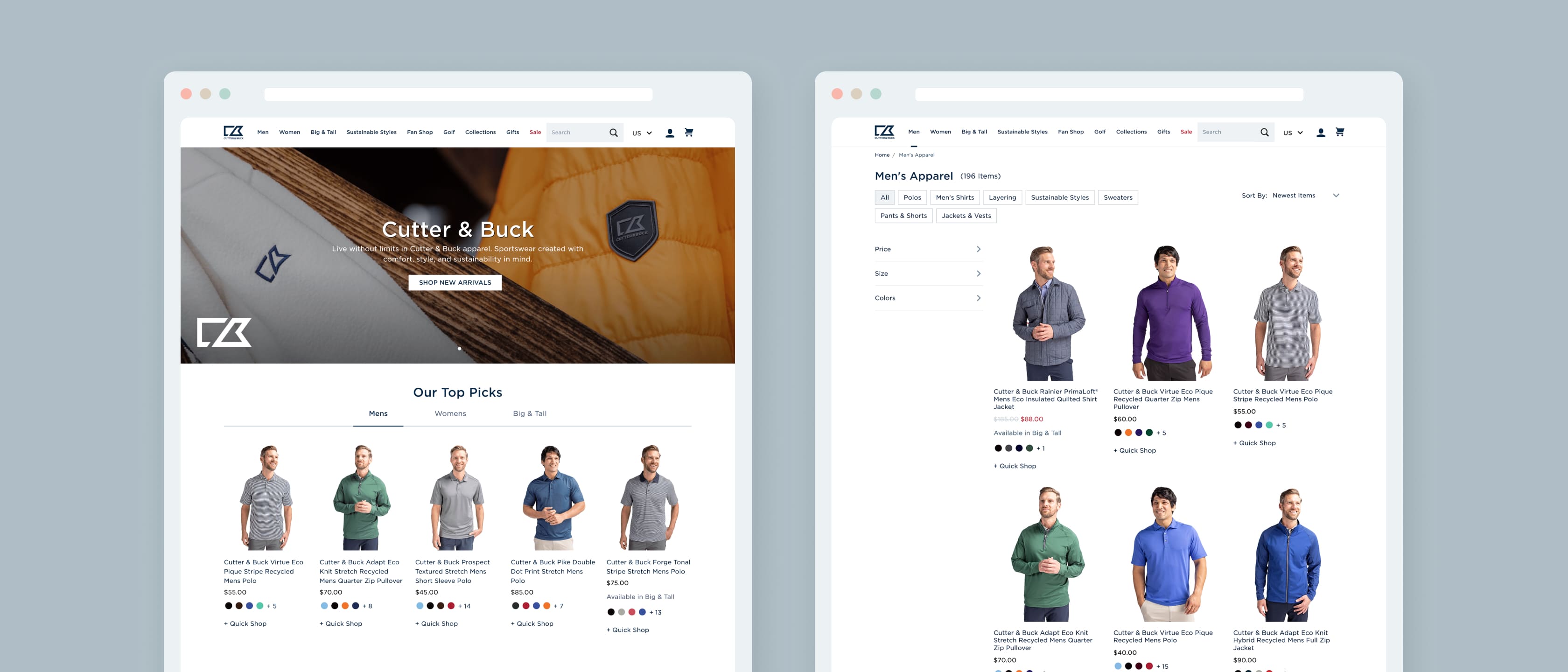
Our team turned these findings into positive ideas to increase revenue and conversion for Cutter & Buck. Our first focus was resolving the scroll map issues from the existing version. To start, we recommended that the site’s overall navigation bar and hero image’s height be reduced significantly. Additionally, we increased both the size and visual prominence of the search bar on the site to reflect its high interaction rate.
While the search bar was being reorganized, we leveraged Searchspring functionality to optimize the site's merchandising experience. Searchspring allows for greater customization of results based upon a user's behavior on the site.
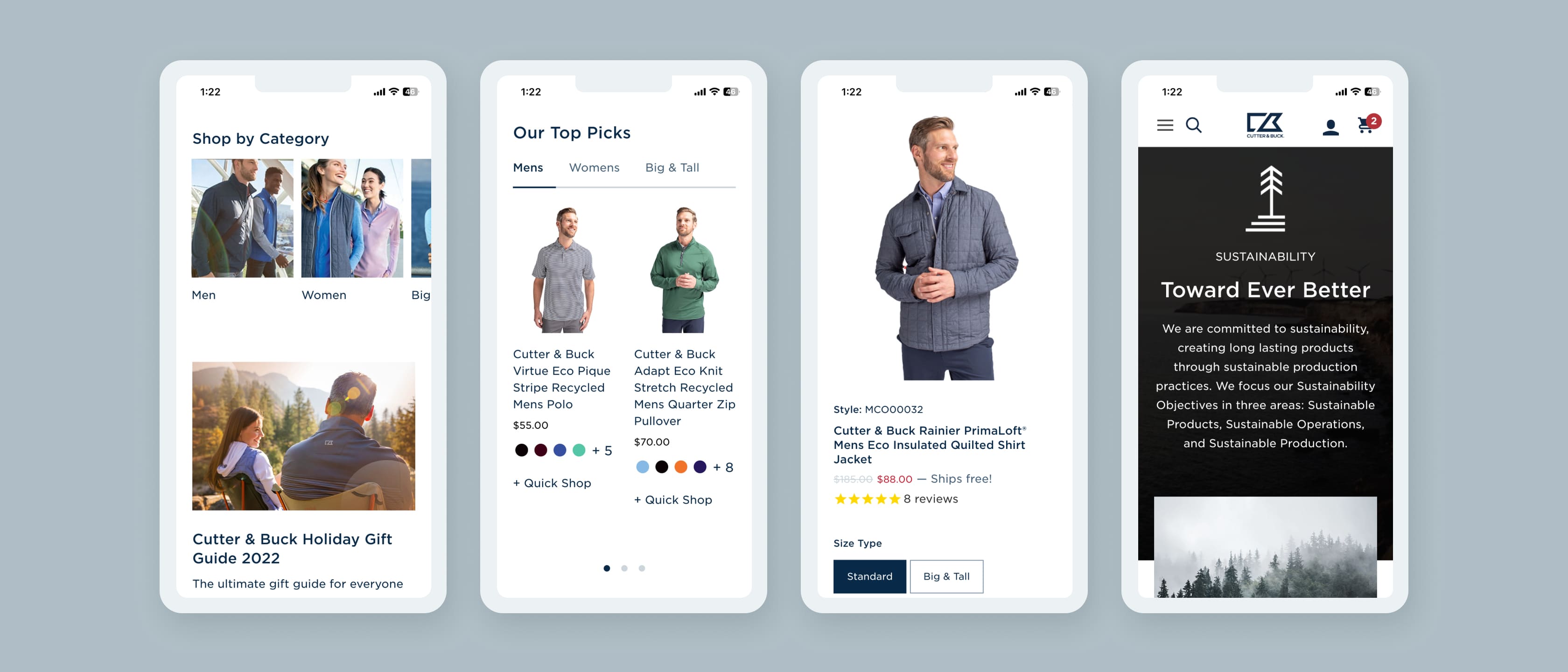
Additionally, our team wanted to increase the prominence of individual products on the homepage experience because of their high click rates. Based on this insight, we introduced an "Our Top Picks" area with tabs that allow users to select their respective product categories.
As site traffic continues to grow from mobile sources, making sure that a website caters to a customer's screen size of choice becomes more critical each year. To ensure that mobile users have the best experience possible, Groove Commerce made two major site-wide changes.
First, we reduced the mobile site's Navigation Bar's height by approximately 50% to lend more space to relevant content while browsing or typing a query in the search bar. The search bar is also now located within a newly redesigned “Hamburger Menu” which displays categories as left-justified text links. This replaces the previous design with an optimized and easy to use experience.
Another idea we brought to the table was to completely reimagine the homepage and category page’s promotional content modules. To accomplish this, we integrated Searchspring’s machine learning capabilities directly into content modules. This feature allows Cutter & Buck to show users products that are the most popular, highest margin, or in season while being in line with their browsing habits. Instead following the long path of “Women’s > Jackets > Product Page > Product Detail Page”, a user can now jump directly to a Product Detail page from the homepage based on their habits up until that point.
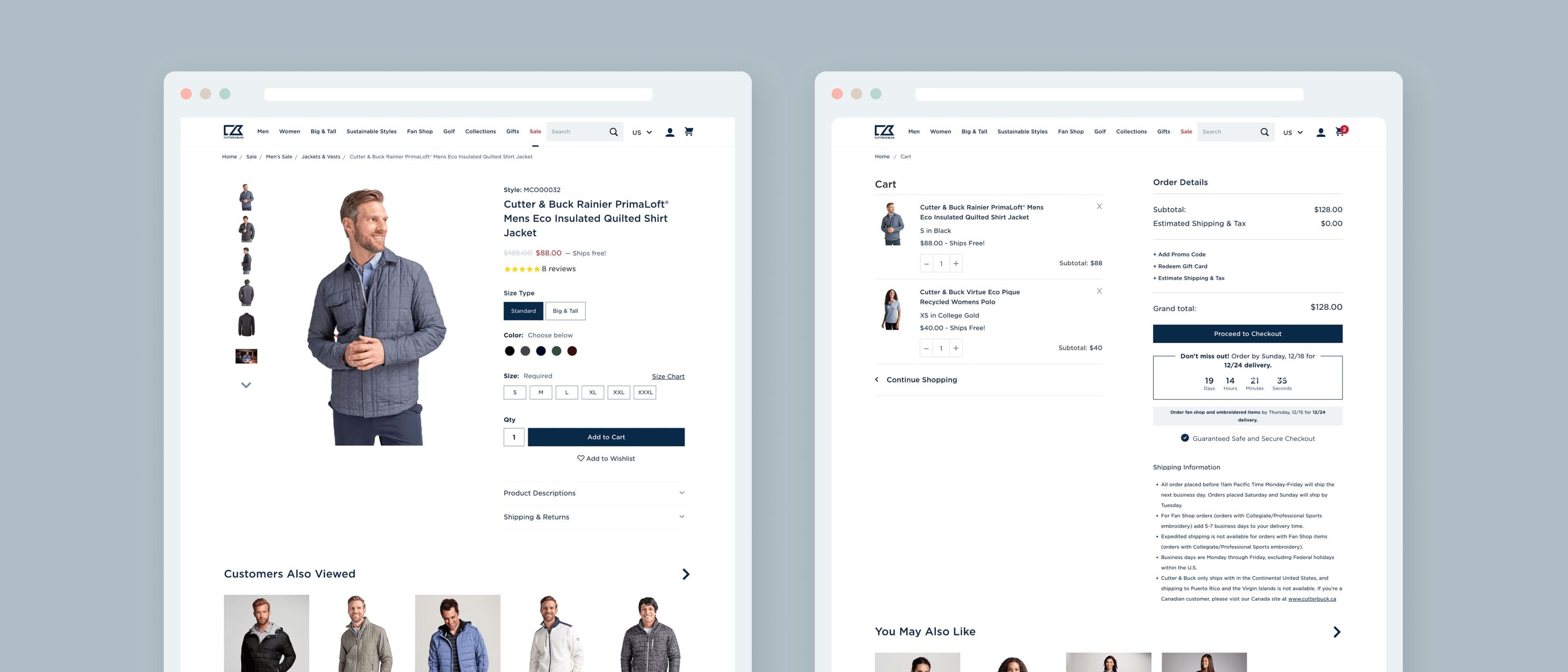
In regards to Product Detail pages, our tests signaled user habits in line with current eCommerce trends. Users were found to spend most time on product pages switching between size and color options. Additionally, many users chose to view photos of the product from different angles before making a decision.
To make the best use of these trends, our team of designers and developers increased the image carousel size, introduced variant swatches and removed the breadcrumbs path from the top of the page on mobile screens.
Most importantly, we increased the "Add to Cart" CTA size significantly to drive conversions. These changes allow the customer to view the information they feel is important more readily while eliminating distractions.
One of the easiest places to lose a customer? Just a few clicks from the finish line, also known as the online checkout.
To prevent this from happening, we made changes to the Cart and Checkout pages of the website. Most importantly, we reworked the Mobile Cart to move the checkout CTA (call to action) on the Cart page from the bottom to the top of mobile screens. This means that when a user has many items in their cart, they do not need to scroll down to take the next step.
In addition, we added clear callouts for shipping and returns that makes the customer more comfortable purchasing from a potentially unfamiliar online store.
Lastly, clearly labeled recommended products at the bottom of the checkout page using Searchspring’s database to display products that the user may find valuable and help to increase average order value.
Results
Cutter & Buck’s main objectives were to improve the customer experience and to increase conversions, so we successfully created a unified user experience and user interface. Comparing October 2020 to October 2021, Cutter & Buck noted an increase in nearly every KPI that they track. We’re proud to share that this website design revamp was awarded a Hermes Creative Award in 2022. If you’re looking to achieve similar results, schedule time with a consultant below.
Revenue
Average Order Value
Conversion Rate
What Our Clients Have To Say

"Since we began working together about 2 years ago Groove Commerce has become our one stop solution for marketing services, paid media advertising, and website support."
