Doc Popcorn

Google Page Speed
Custom Widgets
Industry Awards
How We Designed a Specialty BigCommerce Franchise Storefront for Doc Popcorn
Doc Popcorn is a sister company to Dippin’ Dots, a brand famous for its small frozen treats. Doc Popcorn offers high-quality and freshly popped popcorn to consumers across the United States with numerous franchised retail locations.
When Dippin’ Dots underwent a complete website overhaul, Doc Popcorn used this opportunity to revitalize its site’s appearance and functionality, so we stepped in to improve UX and UI elements.
The Challenge
Increase Brand Recognition
Although Doc Popcorn is well-known to those near franchise locations, many across the country haven’t been able to experience the brand and its offerings. The Doc Popcorn team wanted to help potential customers connect with the brand and view retail locations nearby.
Additionally, the Doc Popcorn team wanted to elevate the site’s design to reflect the brand’s fun and inviting style. The previous Doc Popcorn site was powered by Magnolia CMS, and had minimal animations, graphics and branded content for customers to connect with. Our team set out to find out the best ways that Doc Popcorn could enable fans everywhere to interact with the high-energy brand.
Driving Sales
Prior to this website project, the easiest way for users to purchase popcorn was to travel to a Doc Popcorn franchise location. Customers could alternatively request a home delivery form, submit that form and expect a franchisee to fulfill their orders outside of the common eCommerce experience that we all have learned to love (order confirmation, tracking number, etc.).
Although this updated site would continue without an eCommerce checkout, the Doc Popcorn team wanted to use this website project as the opportunity to streamline and simplify the online order and home delivery process. With this in mind, our team began to formulate how to most efficiently get delicious popcorn into the right hands.
Production & Shipping
Because Doc Popcorn prides itself on fresh and high-quality popcorn, they produce their product at franchise locations instead of a central production facility.
To overcome this hurdle, Doc Popcorn retailers fulfill home delivery requests from production to shipping. This allows Doc Popcorn to test the success of their product in an eCommerce environment (for regions where it is offered) without taking on the financial burden that a centralized fulfillment system would require. Additionally, franchise locations gain the benefit of increased sales numbers when an eCommerce customer in their region places an order.
The Solution
By migrating Doc Popcorn from Magnolia CMS to BigCommerce, we were able to offer customers a more streamlined experience.
This newly redesigned site acts as a home base for potential customers who can explore the brand, find their favorite flavor and identify their nearest location to order from. Our team of designers took each part of the previous Doc Popcorn site and analyzed the function it served, as well as how it could be improved.
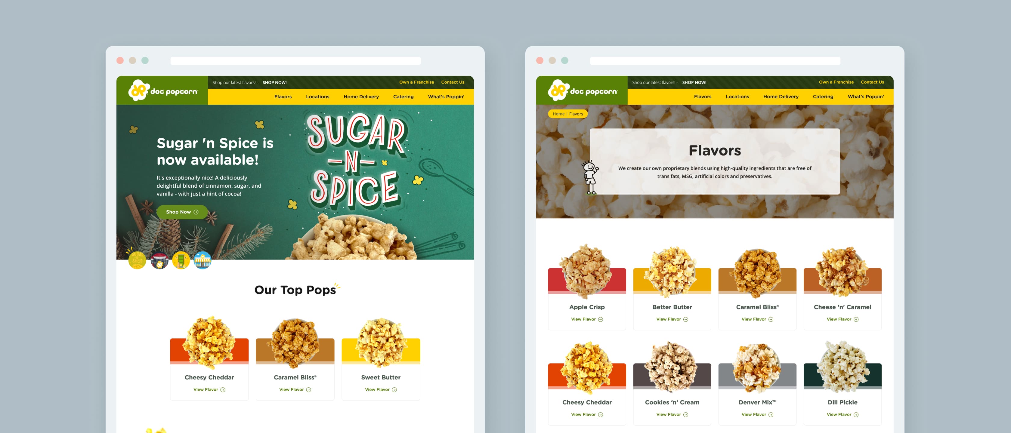
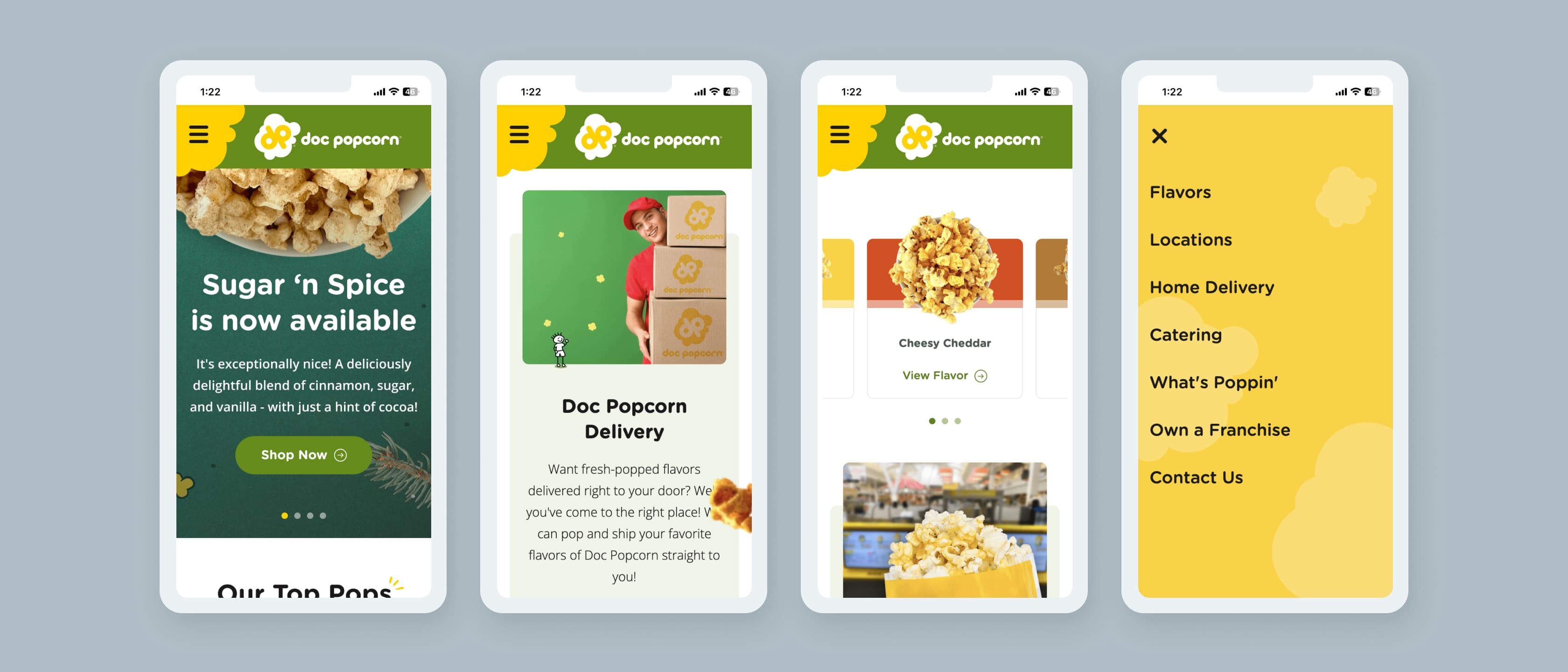
Our team optimized UI elements, including creating a widget-based design using BigCommerce’s Page Builder. This included a friendly navigation bar, a branded hero image and three featured flavors for users to choose. Moving down the page, visitors are greeted with information about physical locations, delivery options and Popcorn-related blog posts.
Additionally, we added hidden elements of delight that reflect the brand’s fun appeal – including a “popping” hover animation on product imagery, an exploding kernel mobile navigation and waypoint intro animations for text and image elements throughout the site.
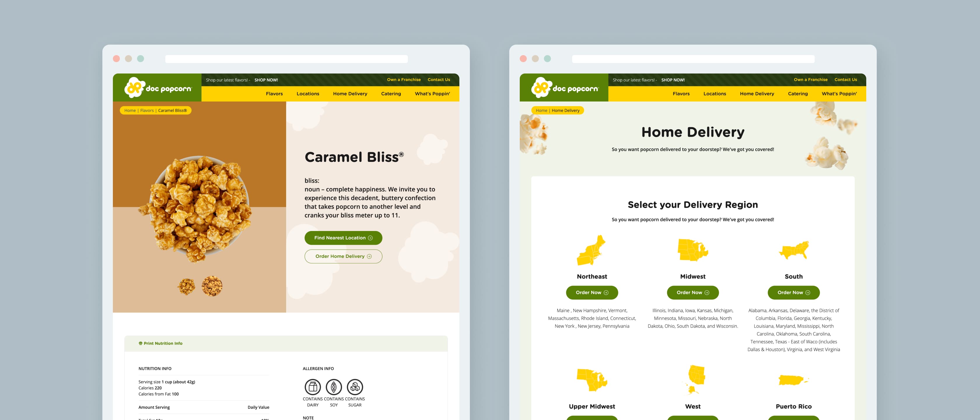
Doc Popcorn offers 12+ delicious flavors. With a wide variety of options, customers wanted to see specific ingredients and dietary information. When customers click one of the joyfully-animated popcorn buckets, the site takes them to a comprehensive nutritional information page. The page lists every ingredient as well as its effect on the product as a whole in an easy-to-understand user interface.
Although this site does not leverage a checkout or cart, it uses BigCommerce’s catalog functionality to manage flavors as products. Furthermore, we helped Doc Popcorn maintain their nutritional information in a centralized location leveraging BigCommerce custom fields. Plus, this chart can be printed to help franchisees clearly display nutritional information to customers.
Although Doc Popcorn previously leveraged a store locator, it did not provide a seamless experience to end users. With our updated store locator, users can narrow their search by location and radius to easily find the store closest to them.
Once users locate their desired stores, they can click a simple “directions” button, which opens the exact location inside of Google Maps either on their personal computer or smartphone.
As discussed above, Doc Popcorn is not operationally set up to serve customers from a central production facility. Doc Popcorn customers can select their region, and order the products they are looking to purchase from the nearest franchise location. With this information in mind, our team created an experience similar to the eCommerce process customers are used to.
We also designed the site to allow Doc Popcorn to easily enable traditional checkout and cart functionality in the future if they desire. With this approach, we tackled the client’s immediate needs and helped them plan for a scaling future.
The Results
Overall, the site’s final design and associated performance outpaced the client’s expectations by successfully balancing competing priorities of beautiful imagery, bespoke design and light code weight.
As this site moves into its next era, we are excited to support its growth through ongoing support and optimization. If you’re interested in learning more or exploring how a catalog-only eCommerce store could work for your brand, schedule a meeting with a consultant below.
Google Page Speed
Custom Widgets
Industry Awards
What Our Clients Have To Say

"We originally came to Groove Commerce thinking we wanted a web developer to help us with our current site. The Groove Commerce team took the initiative to recommend and migrate us to a new platform that actually met our eCommerce needs."


