Hello Divorce

Users
Sessions
Average Time on Page
Happy Client
How Hello Divorce Revolutionized Divorce Services with BigCommerce
Hello Divorce is an online platform that provides an alternative route to traditional divorce lawyers. With Hello Divorce, users can file for divorce online and take advantage of add-on services such as mediation to assist them throughout the divorce process.
However, Hello Divorce's previous WooCommerce site presented several challenges that resulted in a poor user experience and low conversions. Additionally, the required form process was slow and difficult to manipulate, leading to issues with document generation and display.
The Challenge
Poor User Experience
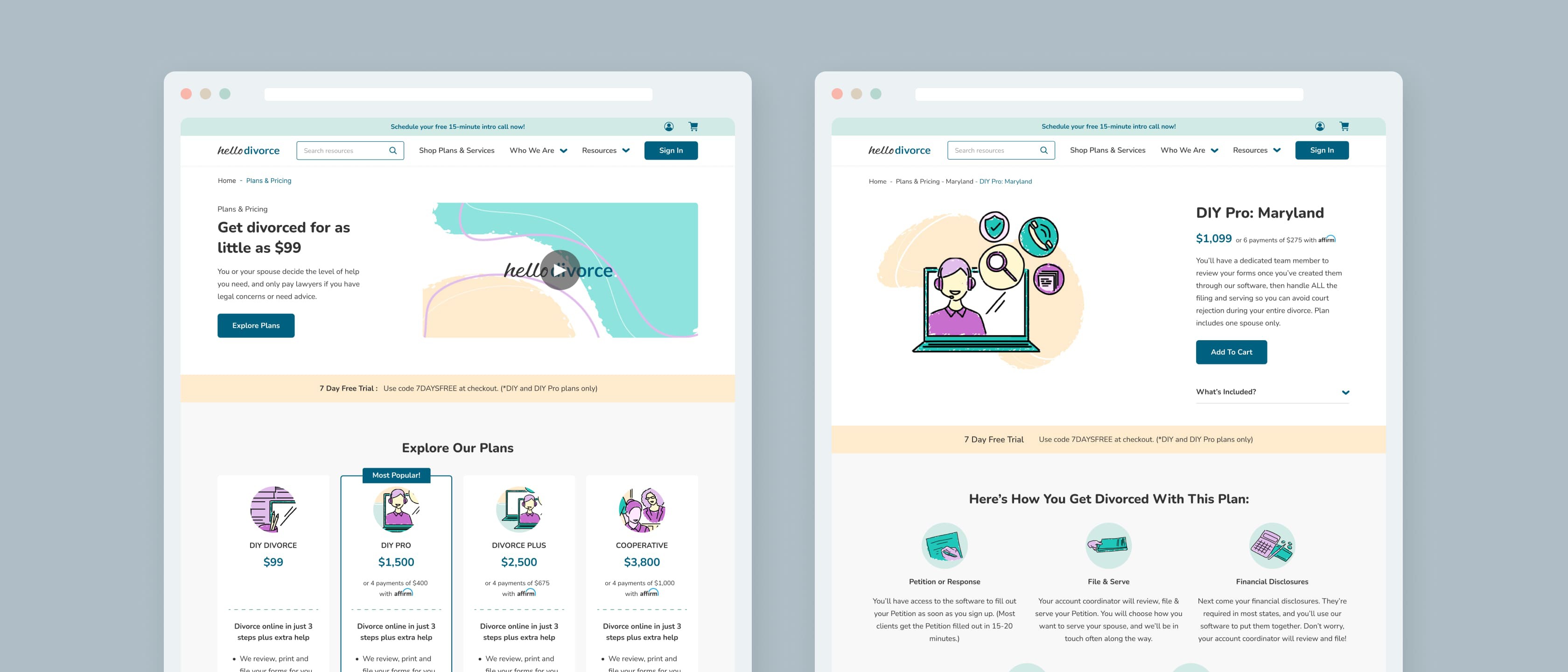
The WooCommerce site's poor user experience led to low conversion rates with a large number of customers simply giving up before payment. The services and plans were confusing and didn't clearly display the different packages available and the states they accommodated. Lastly, The Divorce Navigator was not user-friendly and did not effectively guide users through the divorce process.
Inefficient Form Processes
The platform's form generation and completion process was slow and difficult to manipulate, which resulted in frustration for users. Even if a user did manage to fill out the appropriate forms correctly, the documents generated by the platform were often incorrect. You could imagine how this led to further issues for both users and the company.
Difficult to Update Content
The platform's slow and difficult-to-manipulate CMS, WordPress, resulted in additional stress and confusion for Hello Divorce employees. This meant that when new graphics or copy was created to help guide users through the divorce process, it was an entirely different struggle to implement those changes.


The Solution
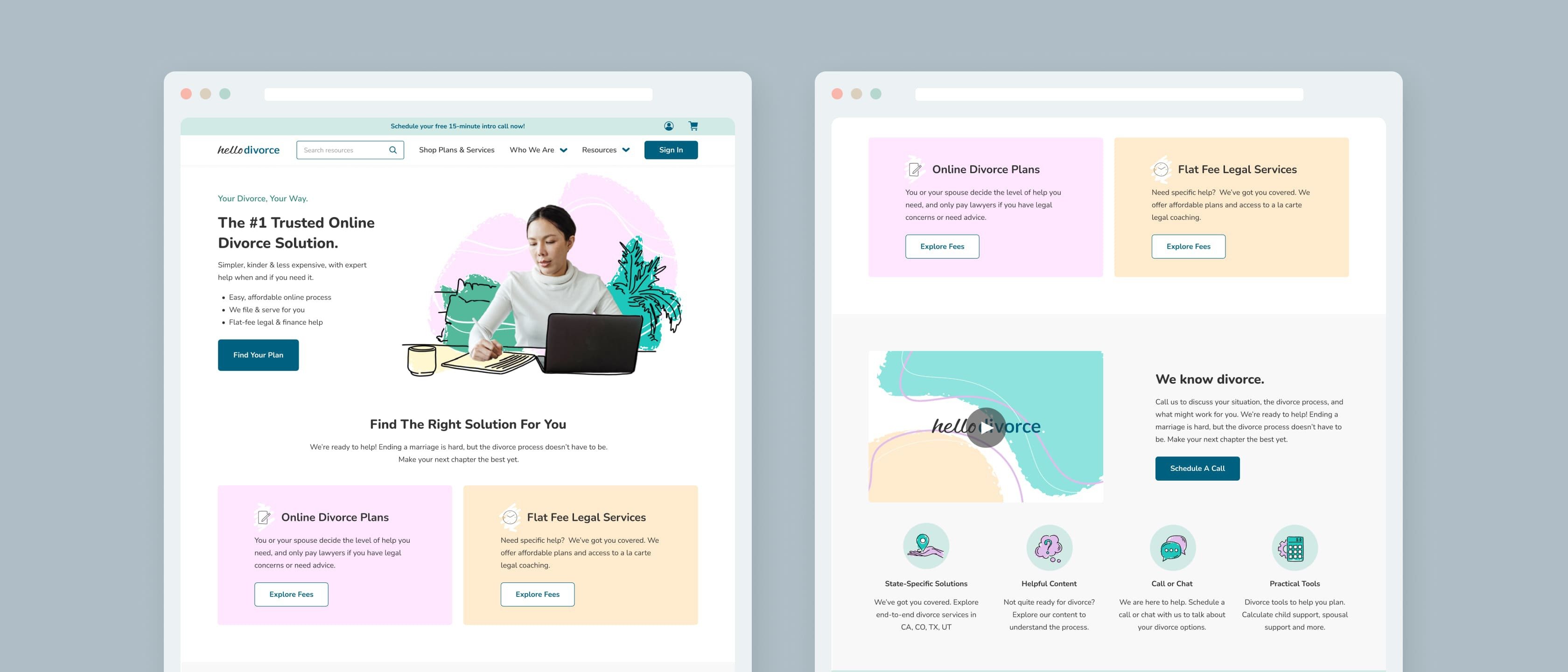
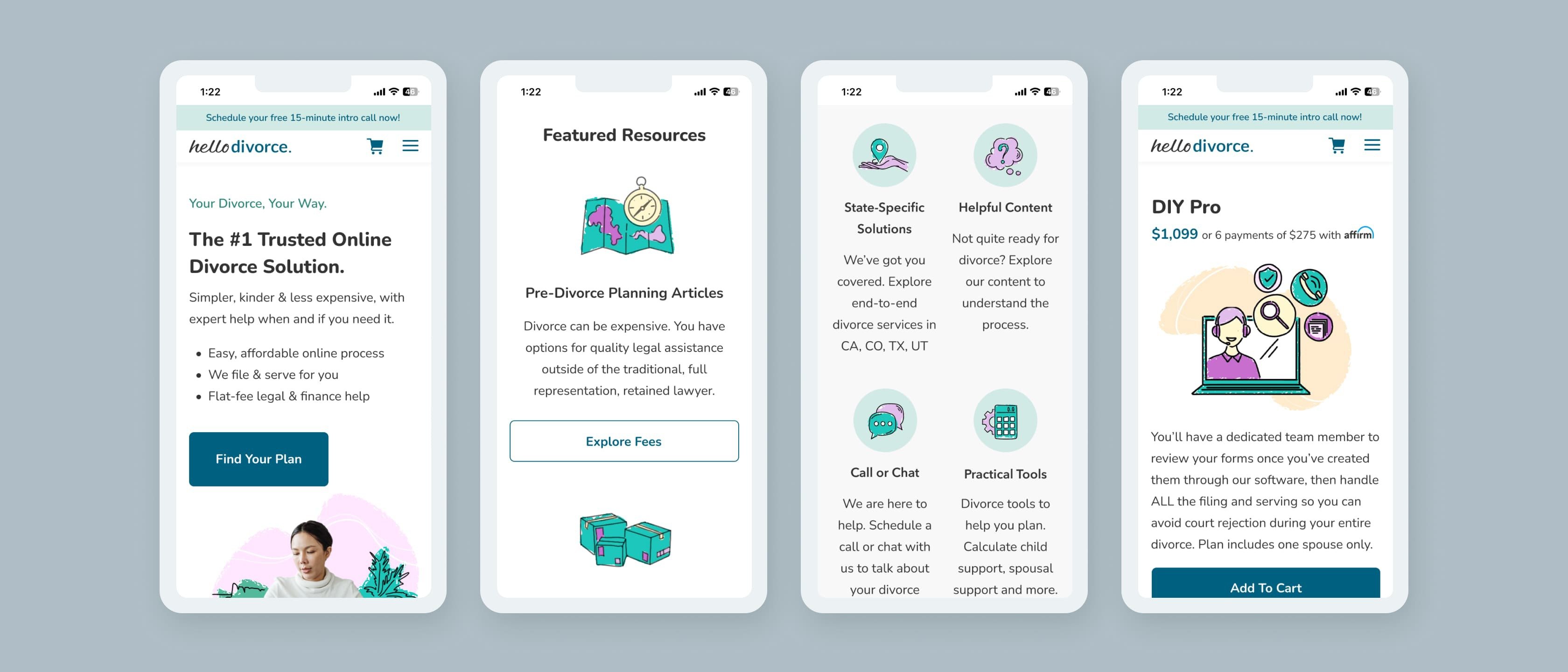
To address the challenge of poor user experience and limited branding, our team worked to expand on Hello Divorce's branding to create a feeling of trust in the DNA of their newly designed website. Our team of designers created custom illustrations, icons, and color palettes for Hello Divorce to leverage. By redesigning the website with a focus on user experience and visual appeal, we aimed to improve engagement and conversion rates.
To address the challenge of an inefficient form process, we implemented Formstack, which made the form process much more efficient and allowed for easy document generation and display. Formstack feeds into HubSpot, which allows Hello Divorce to easily track and manage form submissions. Additionally, the new website uses custom PageBuilder widgets, which make it easy for the Hello Divorce team to modify their website.
Finally, to improve the user experience, we applied a new front-end design to the Hello Divorce “Divorce Navigator.” This feature shows users where they are in the divorce process, what forms still need to be filled out and any additional next steps. If a user has any questions throughout their divorce journey, Hello Divorce has written a comprehensive set of resources for users to read that are displayed in the “Resources” section of the website.
The Results
In the months following launch, Hello Divorce experienced significant increases in Core Metrics and overall performance. Although many factors influenced this growth, the site's custom branding and UX/UI design helped create a feeling of trust in the website and improved the user experience.
Additionally, the efficient form process and custom PageBuilder widgets made it easy for the Hello Divorce team to manage the website and for users to navigate and fill out the required forms. Finally, the new front-end design for the Divorce Navigator made it easier for users to track their progress and know what steps they need to take next.
Users
Sessions
Average Time on Page
Happy Client


