US Open Shop
%20-%20US%20Open%20Shop%20BigCommerce%20Website.jpg?width=3360&height=1440&name=Banner%20Image%20(Lifestyle)%20-%20US%20Open%20Shop%20BigCommerce%20Website.jpg)
Traffic
Conversion Rate
Online Orders
Online Revenue
Increasing US Open Shop's Conversion Rate by 35%
Located in New York, the US Open is one of four international Grand Slam tennis tournaments. With a massive following, this brand has an enormous demand for merchandise.
Three months before the tournament, The US Open team came to us to deliver fresh art direction, redesign and optimize their BigCommerce store.
With a tight turnaround, our cross-trained team acted swiftly to transform their site.
The Challenge
Elevate the Brand
The US Open team felt that their previous BigCommerce instance didn’t quite match the elegance and prestige of the in-person spectacle. The site was outdated and packed with generic imagery. As a result, the brand missed conversion opportunities and was misaligned with the tournament’s overall direction.
We inherited the previous US Open site from an outsourced vendor and immediately got to work. We knew it was critical to improve the use of screen real estate, update photography and design direction and maximize on-site merchandising.
Project Timeline
With the project kicking off in early May, the US Open was rapidly approaching. A large percentage of the retailer’s revenue was generated during the critical 2-week period that the games were played. We also needed to provide continuous ADA compliance support to ensure that all users, regardless of their disabilities, would be able to interact with the shop.
Art & Photography Direction
On the previous site, the graphics and photos were outdated. From lifestyle images to action shots and product photography, all aspects of the site deserved a polished brand makeover.
To solve this issue, the US Open team tapped our Creative Studio to guide the art and photographic direction for their eCommerce experience and marketing materials.
Static Content Blocks
With an entire site refresh about to begin, the US Open Shop team wanted to be able to easily and dynamically update content without submitting support requests for each change.
Of these static areas, the internal team required the ability to update widgets across the site. These included hero images, product pickers, featured categories and product cards.
The Solution
After assessing the results from our intake and discovery progress, we overhauled the entire site’s experience.
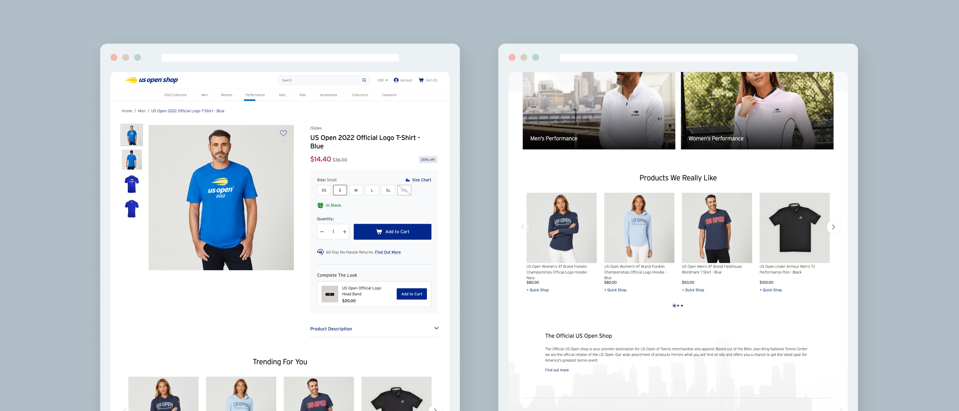
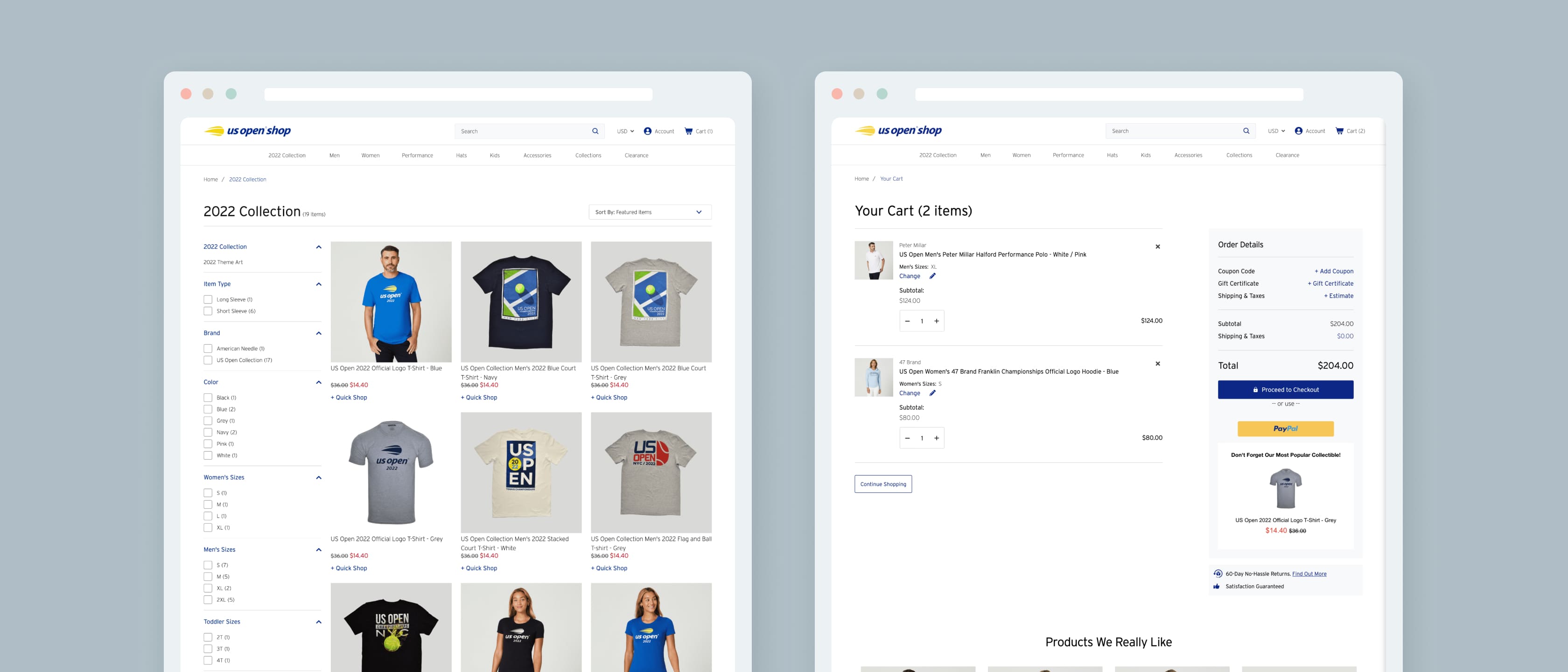
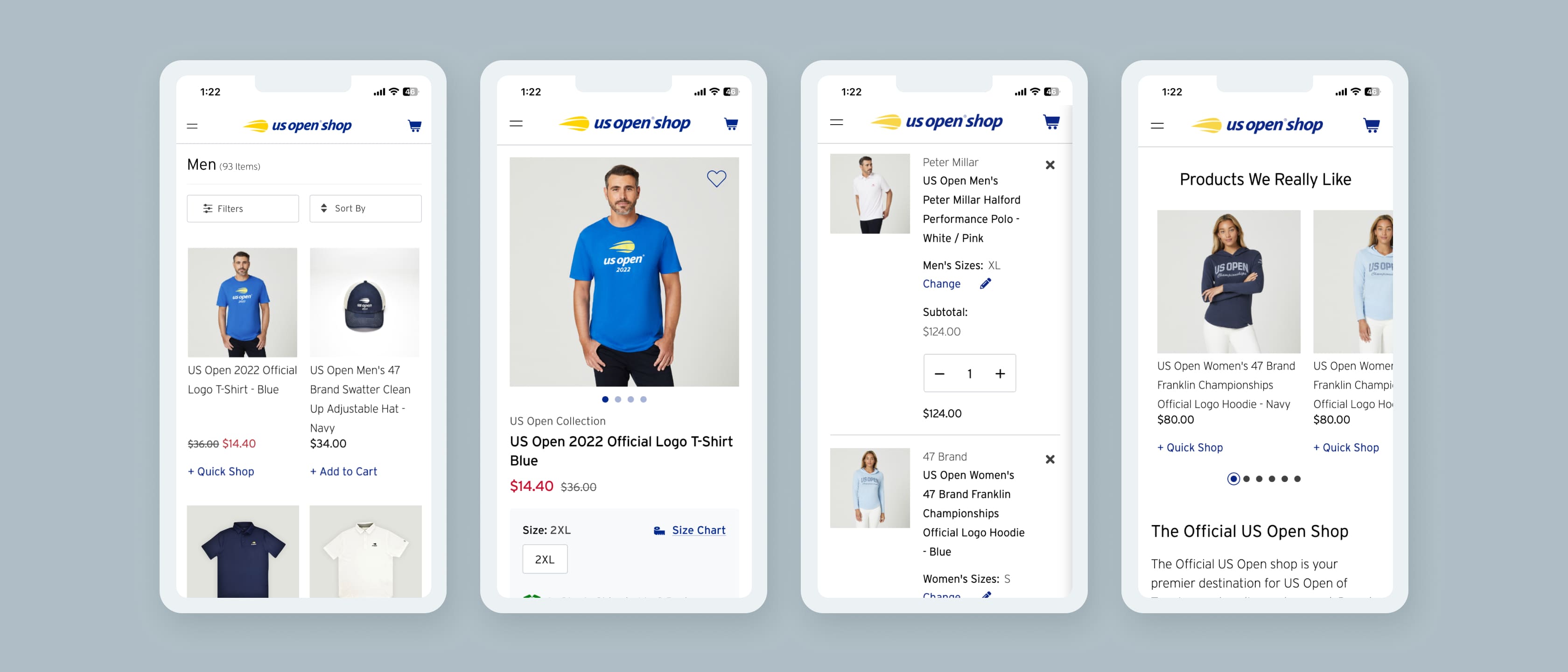
On the homepage, we modified the sizing of all site elements to optimize for conversions. Underneath the new hero image area, we displayed product categories as on-brand icons for fast navigation on mobile. Beneath this category area, we added a “featured products carousel,” which included a“products we like” widget.
On the product listing pages, we added additional filtering options that customers can use to sort products by type, color, relevance, and many other conditions. Additionally, our team implemented one-click upsells on the product detail pages to help lift AOV (average order value).
Even with the site’s content modules redesigned, we noticed that the site’s graphics and photography did not match the high-quality branding that the US Open uses in other mediums.
Our team created an art direction guide that the internal team as US Open Shop took to their preferred photographer. Once the new photo assets were given to our team, we worked diligently to implement them on the homepage, category pages, and product detail pages.
One of the single largest tasks we had from the US Open Shop team was enabling them to dynamically and easily update content as needed. With this in mind, our team ensured that every area of the site was built using BigCommerce’s page builder widgets. These widgets allow for copy, photography and call-to-action buttons to be updated by anyone with basic knowledge of the eCommerce platform.
ADA compliance isa rising concern for eCommerce merchants everywhere. With nearly everyone communicating and shopping online, it is important that merchants enable individuals with disabilities to browse and purchase from their websites. We built the entire US Open Shop with ADA compliance in mind.
Once the site was launched, we worked with an independent 3rd party to review it further. After the assessment was complete, our team provided ADA compliance services to ensure that all areas of the site met the standards.
The Results
Despite a strict deadline in place, the redesign project went off without a hitch.
If you’re looking to increase online orders and redesign your website ahead of a busy seasonal event, book time with a Groove consultant below to see how our team can step in.
Traffic
Conversion Rate
Online Orders
Online Revenue


